
The living room is the room in my house which has seen the most change in the 8.5 years we’ve lived here. Until we renovated the kitchen, it was always the main hangout for the whole family, probably because that’s where the telly lived. When we first moved in, in November 2012, all our dolla had been spent on buying the house and there was nothing left for any renovations in the foreseeable future. So, we lived with a grotty backdrop for a loooong time. Here’s how the room looked when we viewed the house:
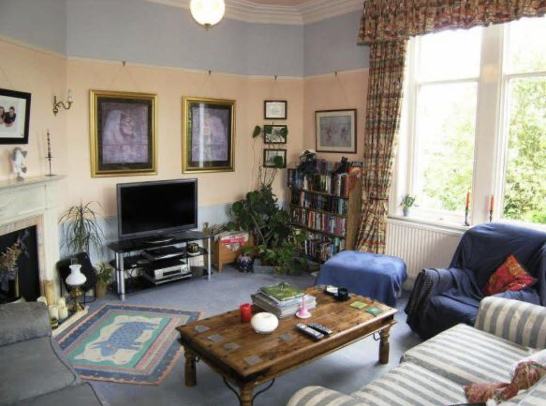
I cast no shade on the old decor, it was (and remains!) a very happy family home which gave me such good vibes when we viewed it that I had a little cry. Absolutely love at first sight. The grimness came when the previous occupants moved out with all their possessions which made the room feel homely, and we were left with the empty shell, with its peach and pale blue walls, and not to put too fine a point on it, MANKY blue carpet, which covered 80% of the house. Oh, and the curtains with ancient Egyptian print. The previous owners took them with them (they stayed in the same village, so we stayed in touch) but I ended up buying them back off them for £50 when I realised how draughty the windows were! They may have been covered in hieroglyphics, but I was prepared to go eye to eye with the Pharoah rather than have the wind whistling through my hair when trying to watch Emmerdale Farm. And £50 was cheaper than the proper glazing we still haven’t got.
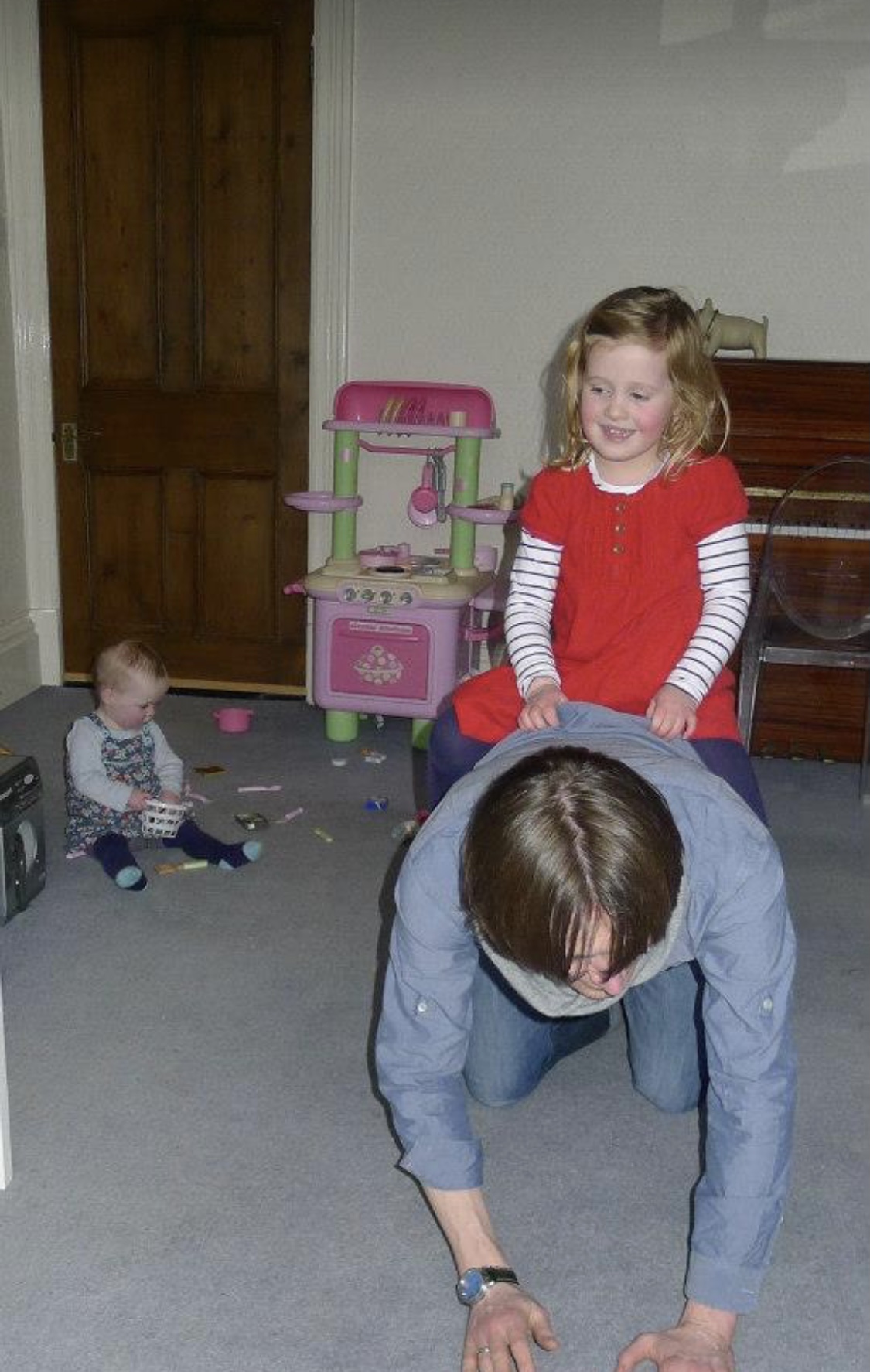
The downside to it all was it created a pretty gloomy atmosphere, and it all felt grubby and generally ick. The upside was my girls went through their potty training/scribbling on walls/spilling EVERYTHING years when there wasn’t anything nice to ruin. The backdrop to all my photos of them at this time is bleak (but I have loved digging out these photos! My ovaries! Twang!). I’d have taken more photos of the room back then if I’d thought for one minute I’d be writing about it nearly 9 years later but, alas, Instagram was only a twinkle in Zuckerberg’s eye at that point.
Dark varnished doors, manky blue carpet 
More manky carpet, curtain woe 
Carpet mank/mahogany door woe part 2 
Bro, nephew, pelmet, light 
Her utter cuteness thankfully detracts from grim carpet situ 
Small witch against peach and blue wall. Decor scarier than outfit. 
My biggest and her 3 cousins. The true delight of the curtains for closer inspection.
In late 2014, we’d been in the house almost 2 years, I was in a job I hated, and generally feeling a bit sad, and I had an extreme “I CANNOT TAKE THIS DECOR ANY MORE” meltdown. I just wanted One Nice Room. And the living room was the obvious candidate (telly, again). Part of the reason I hadn’t even tarted it up with a lick of paint was that it just needed everything doing to it – it had the typical Victorian “one plug socket in the entire room” thang going on, the radiators needed replacing as they were too feeble for the size of the room, it had a gas fire I hated which needed ripping out, the electrics needed a full rewire, et bloody cetera. A lick of white paint was never going to cut it.
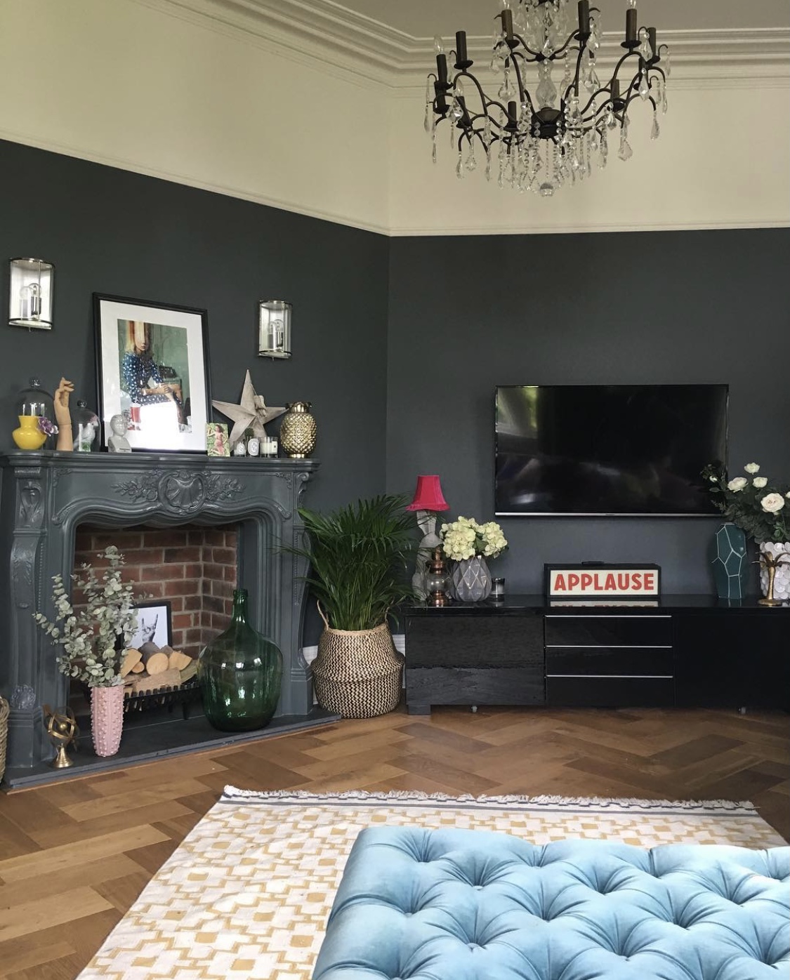
2014: The advent of the Downpipe Years
All of this was pre-Instagram, of course. I had always been interiors-obsessed, had every issue of Living Etc from 2002 onwards stockpiled, and had excitedly latched on to the few interiors blogs which I’d managed to find, one of which was Abigail Ahern’s. She hadn’t brought out her own paint range at that point, and she had basically painted her whole house in Farrow & Ball “Downpipe”, a deep bluey/greeny/grey. It felt new and fresh and exciting, and I was ready to dive in to it headfirst. I bought the paint, and booked the decorator. And the electrician. And the plumber. And the fireplace people. And the flooring people. It’s always a “back to brick” scenario in this house, alas.
Needless to say, Steve, the decorator I used at the time, could not get his head round my colour choice one little bit, and began a campaign to get me to change it to his favourite, Dulux “Timeless”, which is essentially magnolia. He even painted a small section in Downpipe, and said “See!”, thinking I’d be horrified and send it back to the shop, pronto. “Lash it on, Steve”, said I. And he did, and it was wonderful (obviously these pics were from a bit later, as I’ve nicked them from my Instagram account!).
Here’s what I did (by which I mean paid other people to do for me):
- Stripped off every bit of old wallpaper, had the crumbling walls made good, and covered in thick lining paper, painted in Downpipe. Kept the woodwork, space above the picture rail and ceiling (F&B Wimborne) white;
- Removed the old dado rail, left the picture rail in situ. Victorians loved a rail, I personally think you can have too much of a good thing.
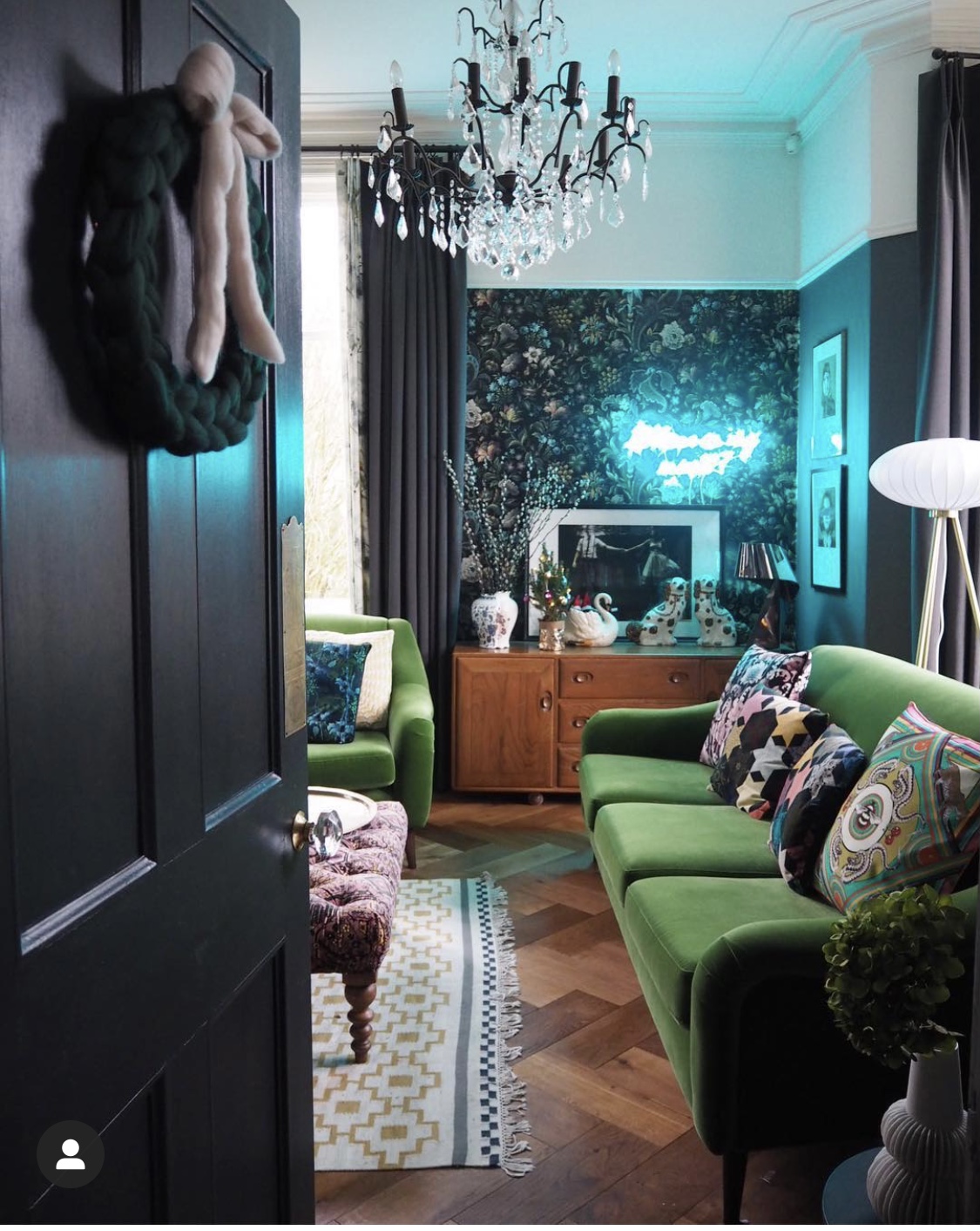
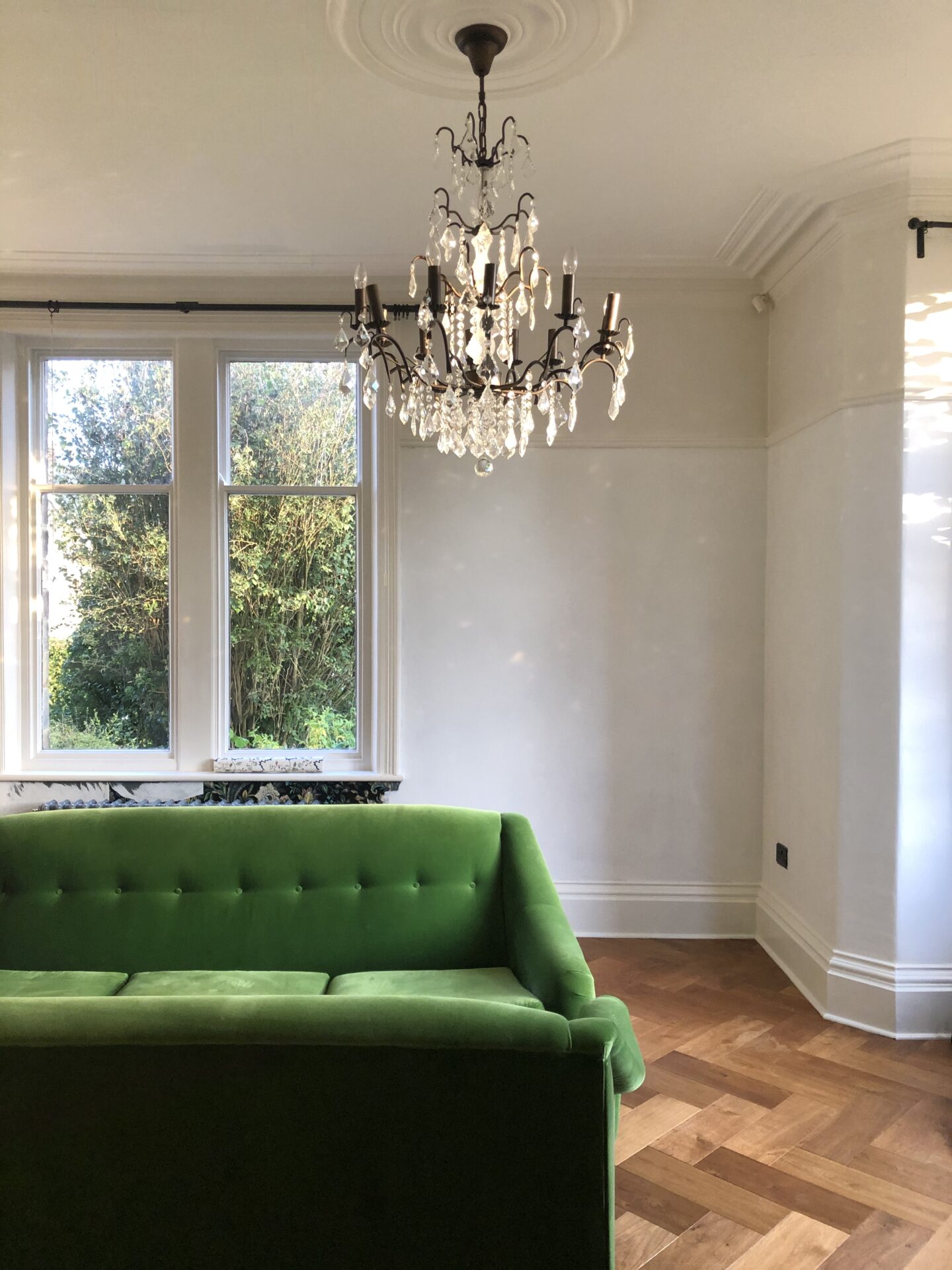
- Added ceiling roses to the existing light fittings, the previous ones had presumably been removed at some point by a savage. Added 2 humungous chandeliers.
- Had all electrics rewired so we didn’t get electrocuted when we turned the lights on.
- Added lots of sockets and electrics to wall-mount the telly. Wall mounted the telly.
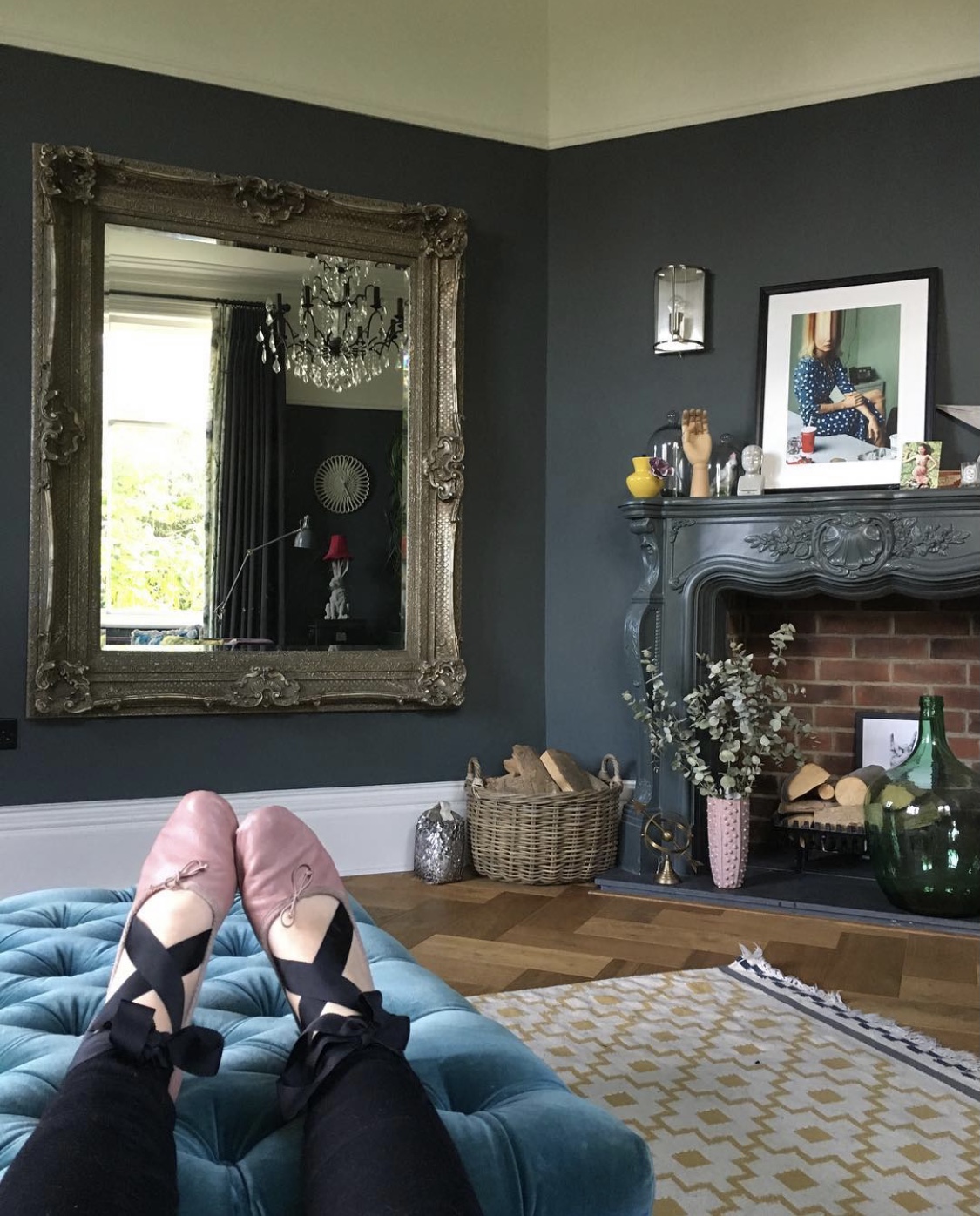
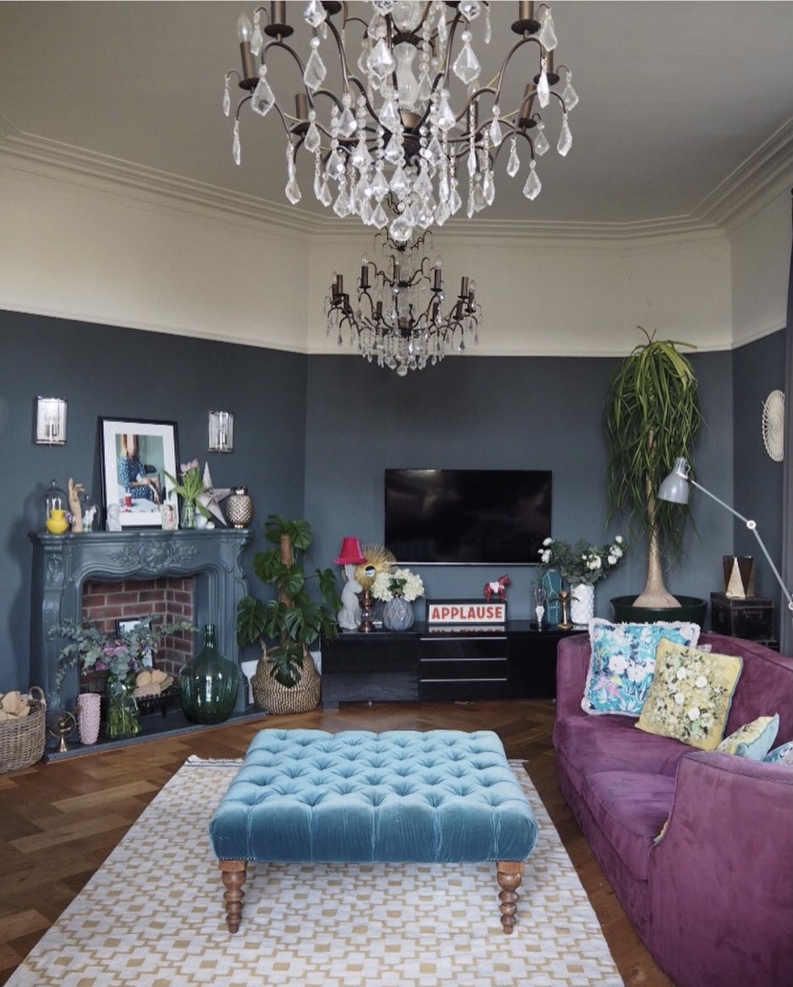
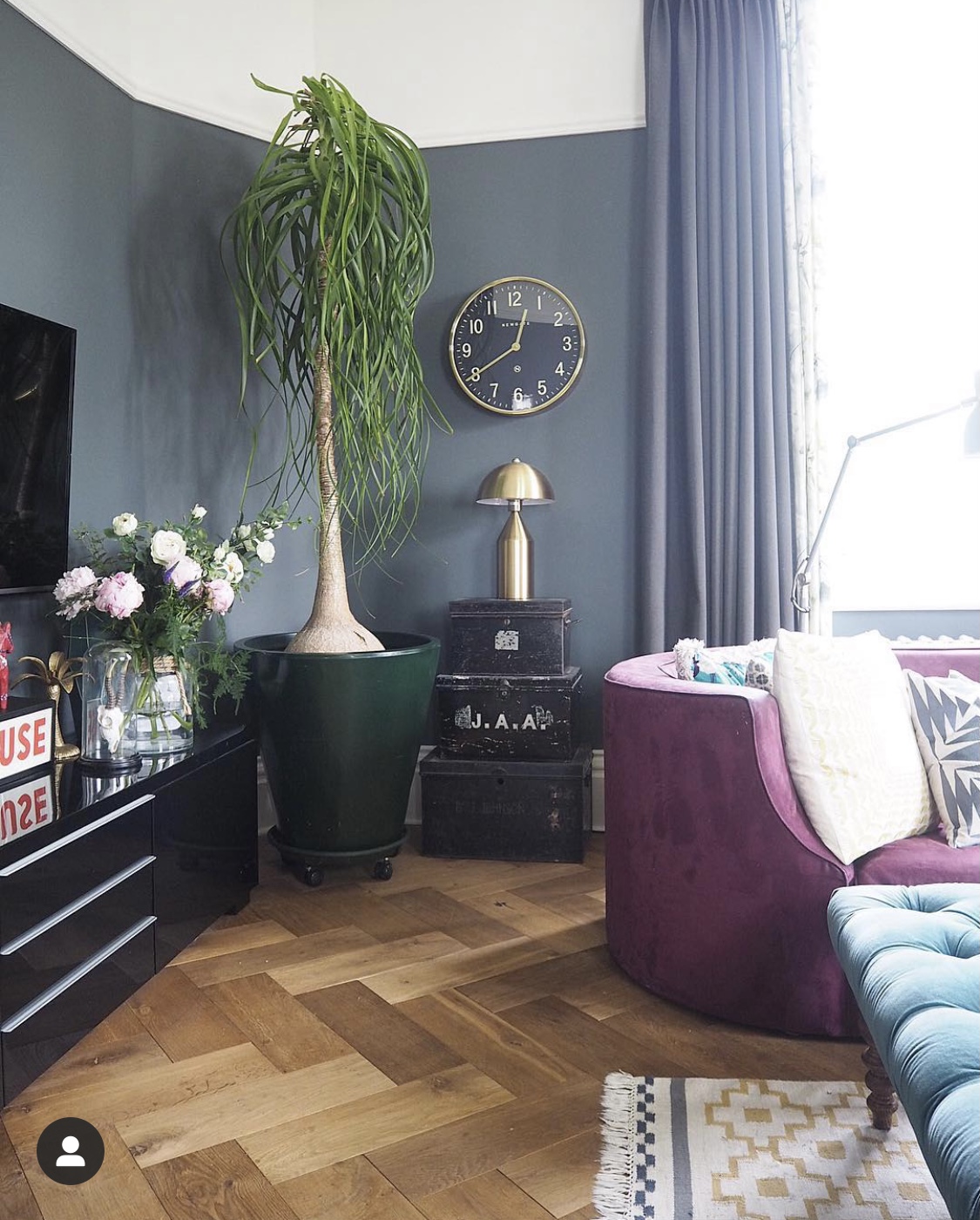
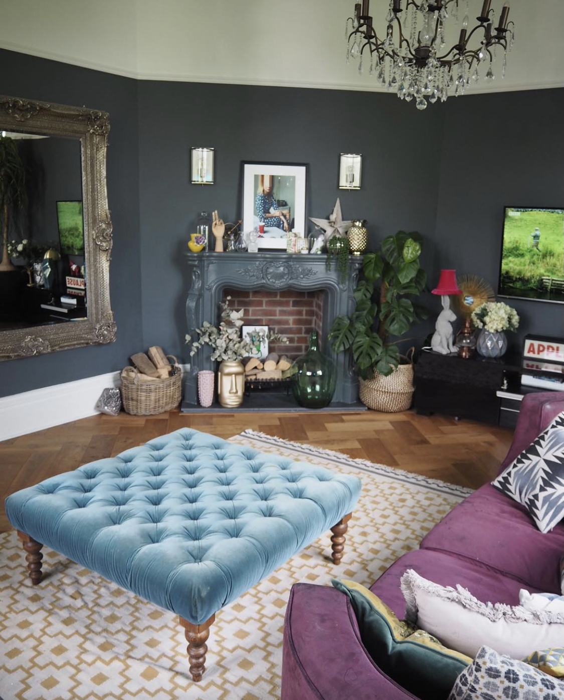
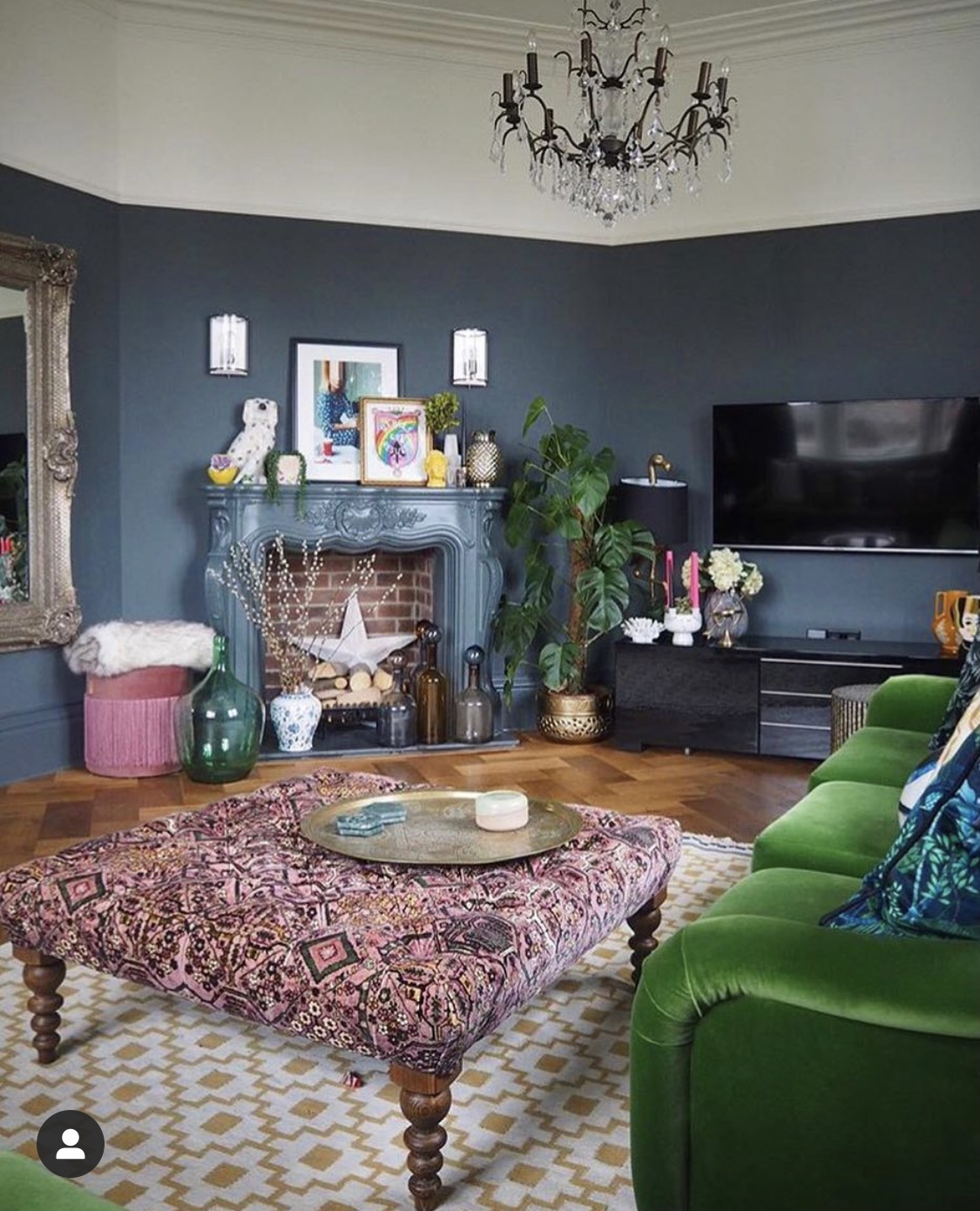
- Ripped out the existing gas fire and mantelpiece. At this point I was sure I’d find some wonderful period features lurking behind the fireplace – maybe an original fireplace? Old tiles? Reader, there was nowt but some breeze blocks and loads of concrete. Story of my life. Installed a plaster Louis-style fireplace, directly inspired by (or “copied from” if you prefer accuracy) Abigail Ahern. Blocked off the chimney. Added decorative brickwork to the back of the fireplace. Added a granite hearth. I’d have loved a log burner but there were no log burner funds. Put a basket of logs in there instead.
- Changed the wall lights above the fireplace.
- Installed cast iron period-style radiators, spray painted in Downpipe.
- Added full length curtains in a fabric which matched Downpipe, edged with a floral, for added excitement.
- Ripped out the blue carpet (HOOORAH!) and added wide plank parquet.
- New rug (Ikea, sadly discontinued, still one of the best rugs ever, in my opinion), new teal velvet footstool (the Valentin from Sofa.com), vintage Ercol sideboard, Ikea media unit in black to “disappear” into the dark painted walls.
As you can see, I was fully committed to the Downpipe. Pant, curtains, radiators. I loved the whole scheme. The paint changed colour in the different light during the day, sometimes greeny, sometimes bluey. The colours of the sofas and the footstool popped beautifully against the dark background. I had my One Nice Room. Happy sigh.
2018: Bring on the pattern
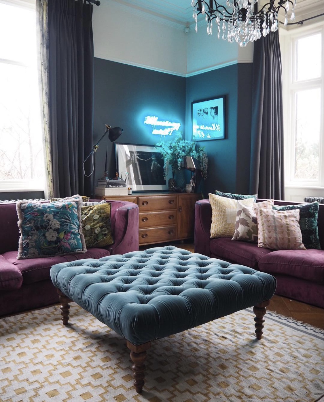
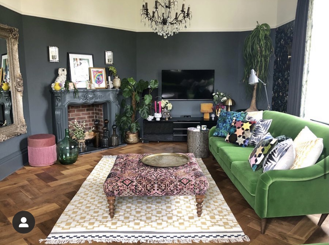
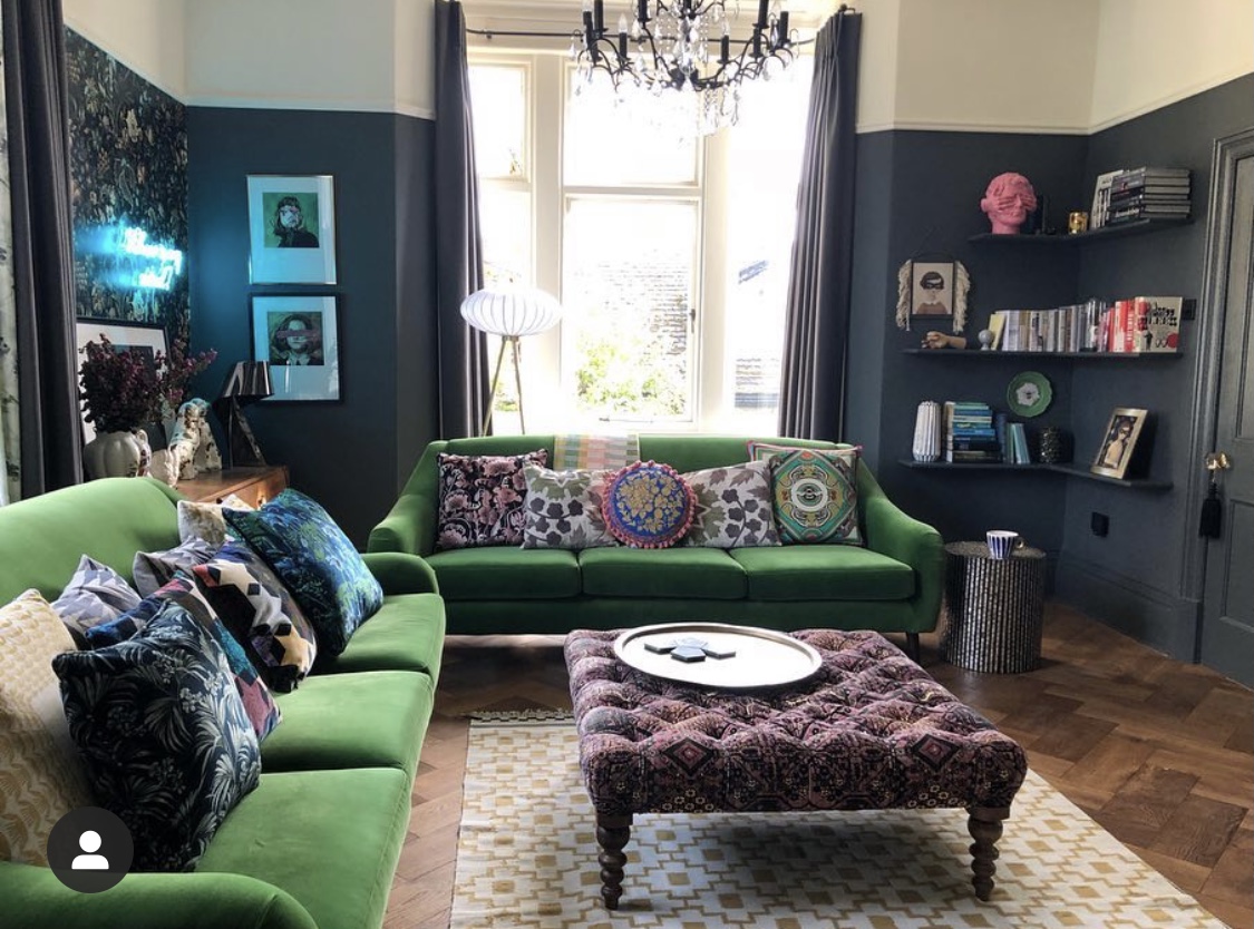
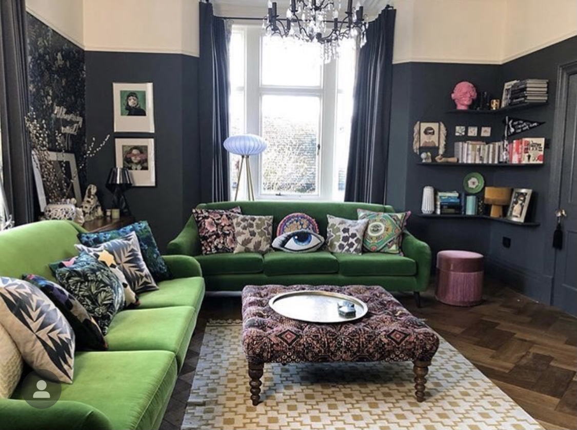
And so 4 years passed, I had left the misery-making job and now had one I liked. I, I mean “we”, had decorated quite a bit more of the house by now and I had a nice bedroom and ensuite, and the hallway had been liberally covered in pink floral House of Hackney “Artemis” wallpaper. I’d always had a bit of an obsession with pattern in interiors, and started thinking of ways to bring it in to the living room. No radical changes, but maybe a little refresh. Also, my beloved Heals curved sofas were on their last legs. They’d done many years of service but the upholstery was, not to put too fine a point on it, completely buggered. I looked at having them recovered, but it was going to be extremely expensive because of the shape. I got talking to a lovely lady called Jo on Instagram, and she had recently set up her own company, Living Room, which made a small but beautifully curated collection of chairs and sofas. I fell in love with some green velvet beauties, flogged the old sofas on eBay to someone who was going to reupholster them herself, and Bob’s your uncle.
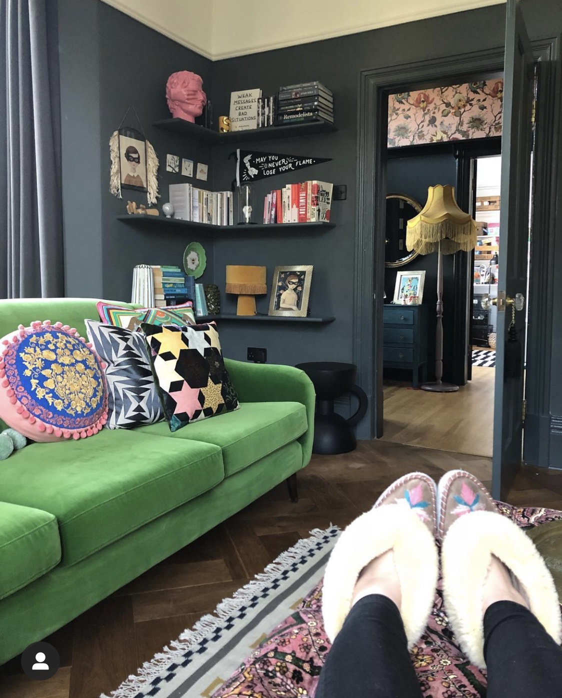
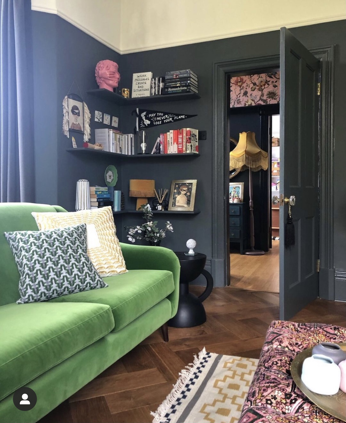
Using the grass green velvet of the sofas as my inspiration, I then had one wall papered by the excellent Jamie at Decspray in “Florika” by House of Hackney, and reupholstered my footstool (previously teal velvet, forever ruined by an incident involving my kids and some yogurt) in “Mey Meh”, again by House of Hackney. I do love House of Hackney. I added a few new bits of art and nick-nacks. I painted the woodwork in Downpipe to match the walls. I had some corner shelving put in. A mini-refresh, and it breathed new life into the room. Loved it.
Here’s a little Reel I made for Instagram, just before I redecorated, for more of a 360 view. It’s always been a hard room to photograph, with dual aspect windows and weirdly angled walls….
2020: Lockdown itchy feet
I don’t need to explain the virus-riddled events which began almost exactly a year ago, in March 2020, and which saw most of us become recluses in our own homes. I won’t dwell on the negative aspects of it all, we have the whole internet available for that. I did, however, end up on the prowl in my own home, casting a critical eye over it. I suddenly fancied a change in the living room. I still LOVED the wallpaper. It’s one of the nicest wallpapers I’ve ever seen. I was, however, craving light and brightness. If I was going to start fiddling with the decor, I wanted it to be radically different.
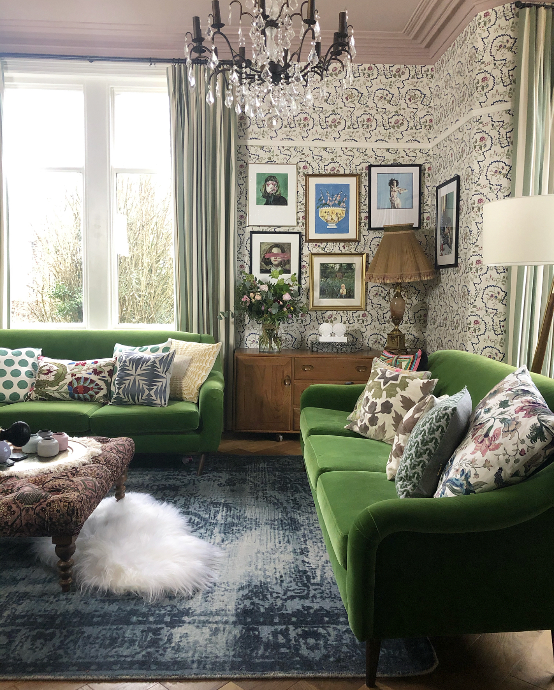
I’d come across a Pierre Frey wallpaper on the Instagram feed of the wonderful Mandy of Space Like This. I instantly messaged her with an “ooooh!!!” and, to cut a long story short, I fell in deep love with the paper (“La Pannonie“) and Mandy, being a great human, helped me via her Interior Design business to get hold of it (Pierre Frey only sell to the industry, dontcha know).
The paper was my starting point. Here’s the thing with me, however. I sometimes jump headlong into things, led by my heart, without any real plan. I’m a Capricorn too, we’re meant to be sensible, I don’t know what comes over me. So I thought I’d get the paper up, and then see how I felt and take it from there. I knew almost nothing from the existing room would look right against it, but I’d work that out later. I took a deep breath, removed the beautiful wall of Florika paper with a minor sniffle, then got Jamie round again (I might as well cut him a key) and he papered the entire room for me. This time, I took the paper right up past the picture rail and to the ceiling, which immediately made the already tall room feel taller. Oh, and I got Jamie to paint the ceiling pink, too. Why not, eh? It’s Light Peachblossom by Little Greene Paint Co, which is a really good, beigey, non-sickly, pink. I also painted all the woodwork white (F&B Wimborne White is my go-to, and seems to work well everywhere in my house).
I actually loved it white! Maybe one day.. 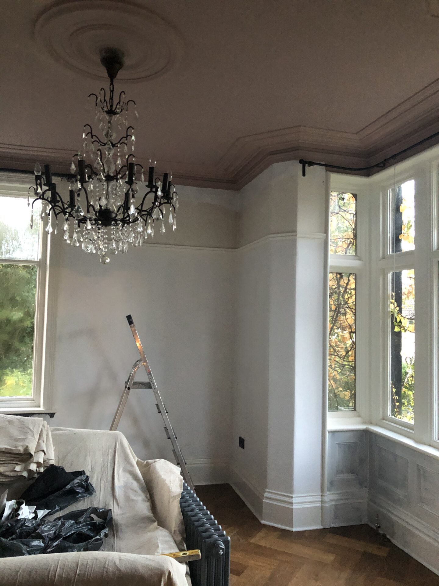
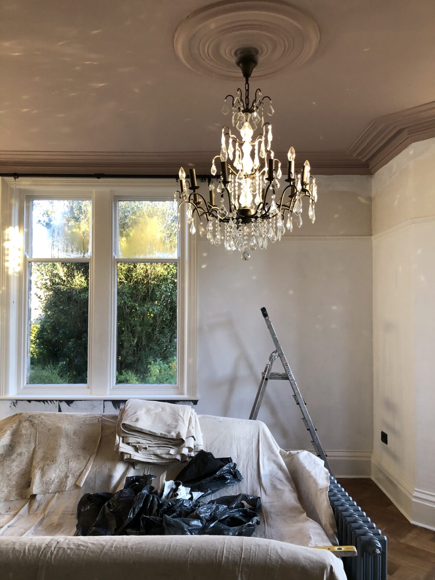
Pink ceiling a-go-go 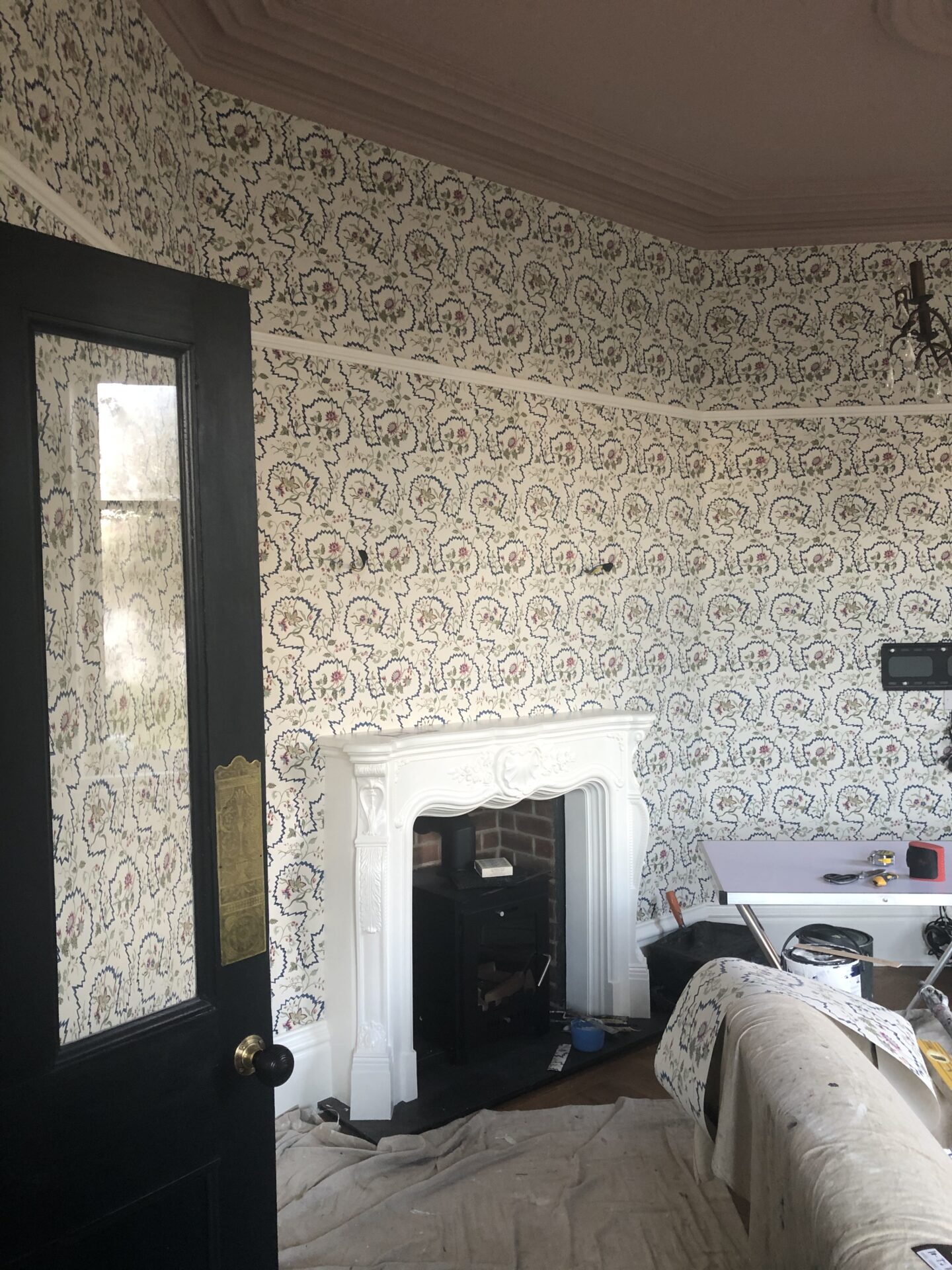
First glimpse of the wallpaper… 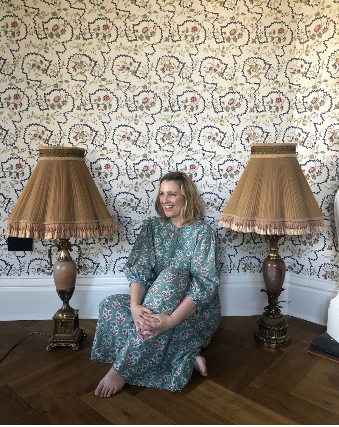
Happy Sandra
The transformation was incredible! I don’t know why, but the wallpaper made me feel like I was in a National Trust property or similar. I swanned around for a bit and wondered whether I should get the family to call me “Ma’am”, or possibly “Your Highness”. It was all light and bright and felt more spacious (I should add, it had no furniture in it at this stage, so that was partially why). The things I owned which still worked well in the room were:
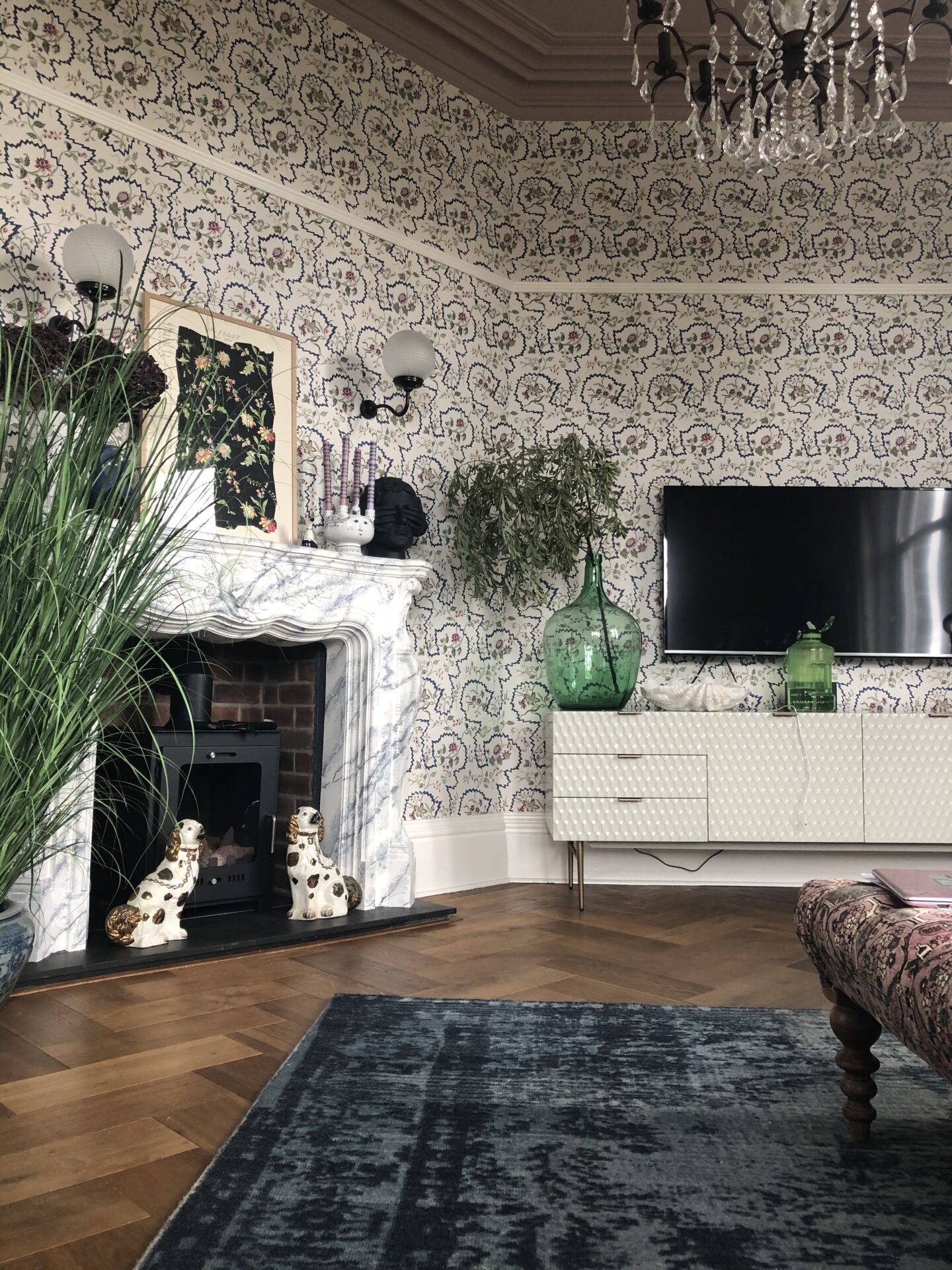
- The humungous chandeliers;
- The Ercol sideboard;
- The sofas. Obviously, my green goddesses were going nowhere.
- Lots of my old cushions.
- The radiators.
- That’s it.
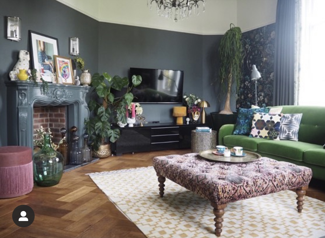
The jury (me and my brainbox) was still out on the footstool. I still loved it but it was pink. The ceiling was now pink, and there was a lot of pink in the very floral, pretty wallpaper. It all felt too girly, too pretty, I got that feeling I always get when something isn’t quite right in a scheme, deep in my stomach. It needed grounding. It needed toughening up. The only way to get past these design roadblocks, if you have the luxury of time, which I very much did, cheers Covid, is to live with it for a bit and the solution usually presents itself. I eventually added a massive, deep blue rug from West Elm*, I painted the door and frame Downpipe (it had previously been Downpipe, I’d painted it white before the new paper went up, then had to repaint it, well done me) and suddenly it all clicked. The pink was grounded and the space felt right. Then I added the following:
- Newly painted mantelpiece – I’ll be honest, I didn’t love the intricate, floral style of the fireplace with the new scheme. It looked great toughened up when it was painted dark, but it felt twee in the new scheme. I had to work with it, though, so painted on a heavily veined, marble effect, which I describe in excruciating detail in this blog post.
- White, ABSOLUTELY GORGEOUS media unit from West Elm* (now discontinued, similar here), which I’d loved forever, and am thrilled to now own.
- New navy painted cabinet.
- Sage green striped curtains of dreams (made with Ian Mankin Devon Stripe Sage fabric*), as a stripe against a floral brings me absolute joy. I re-used the lining from the old curtains for these.
- A couple of pops of bright red, in the form of a lampshade from Pooky, and stool from Oka, which gave the final bit of punch I felt the room had been lacking.
- A brass side table from West Elm*.
- Some excellent new artwork (notably, a Marcus Aitken original from Murus Art*).
- New wall lights above the fireplace from Pooky.
- New flueless bio-ethanol log burner style fireplace from ImaginFires*.
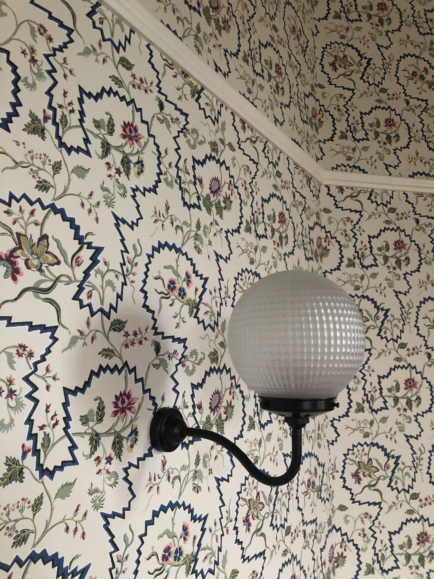
New wall lights… 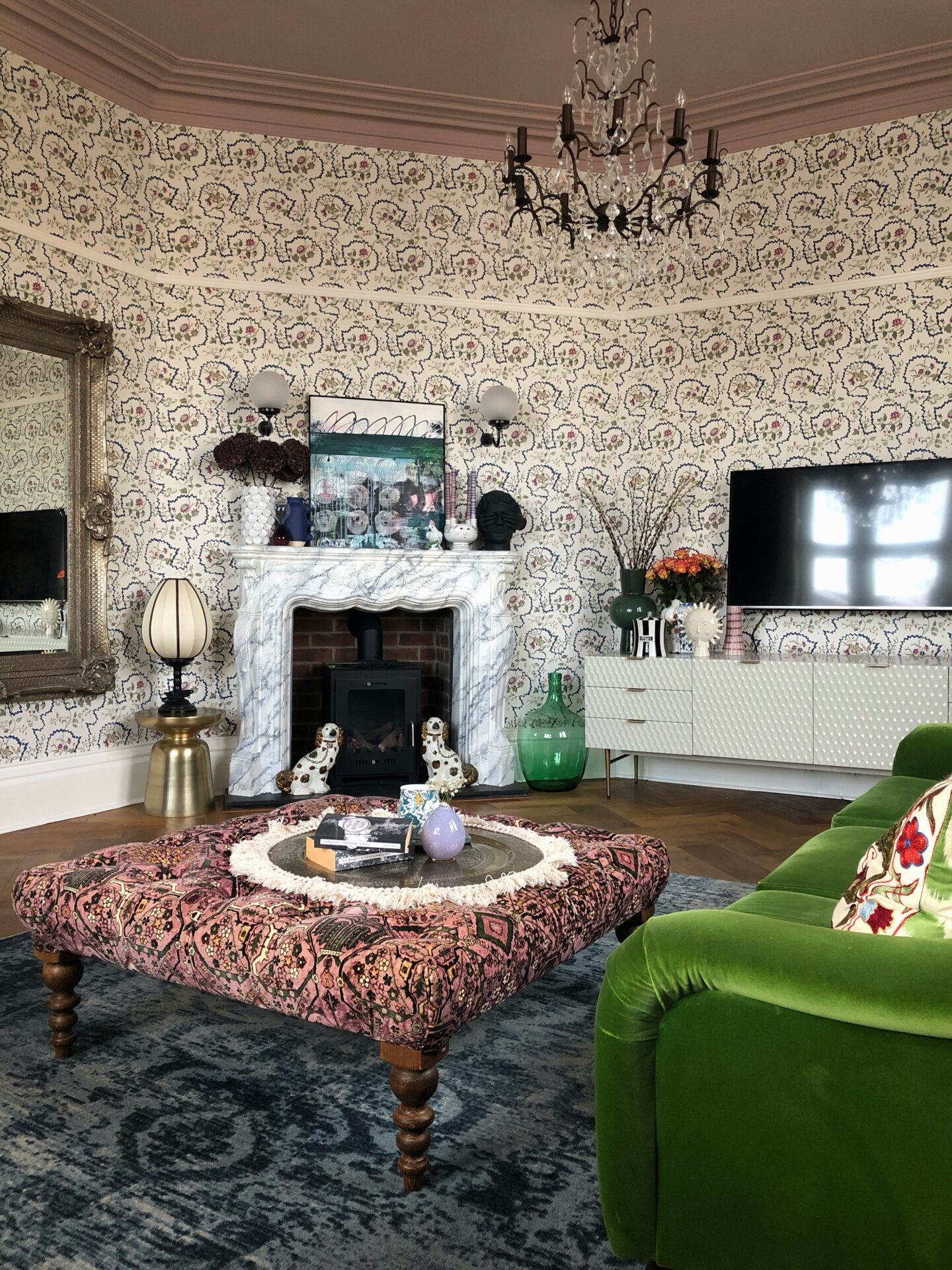
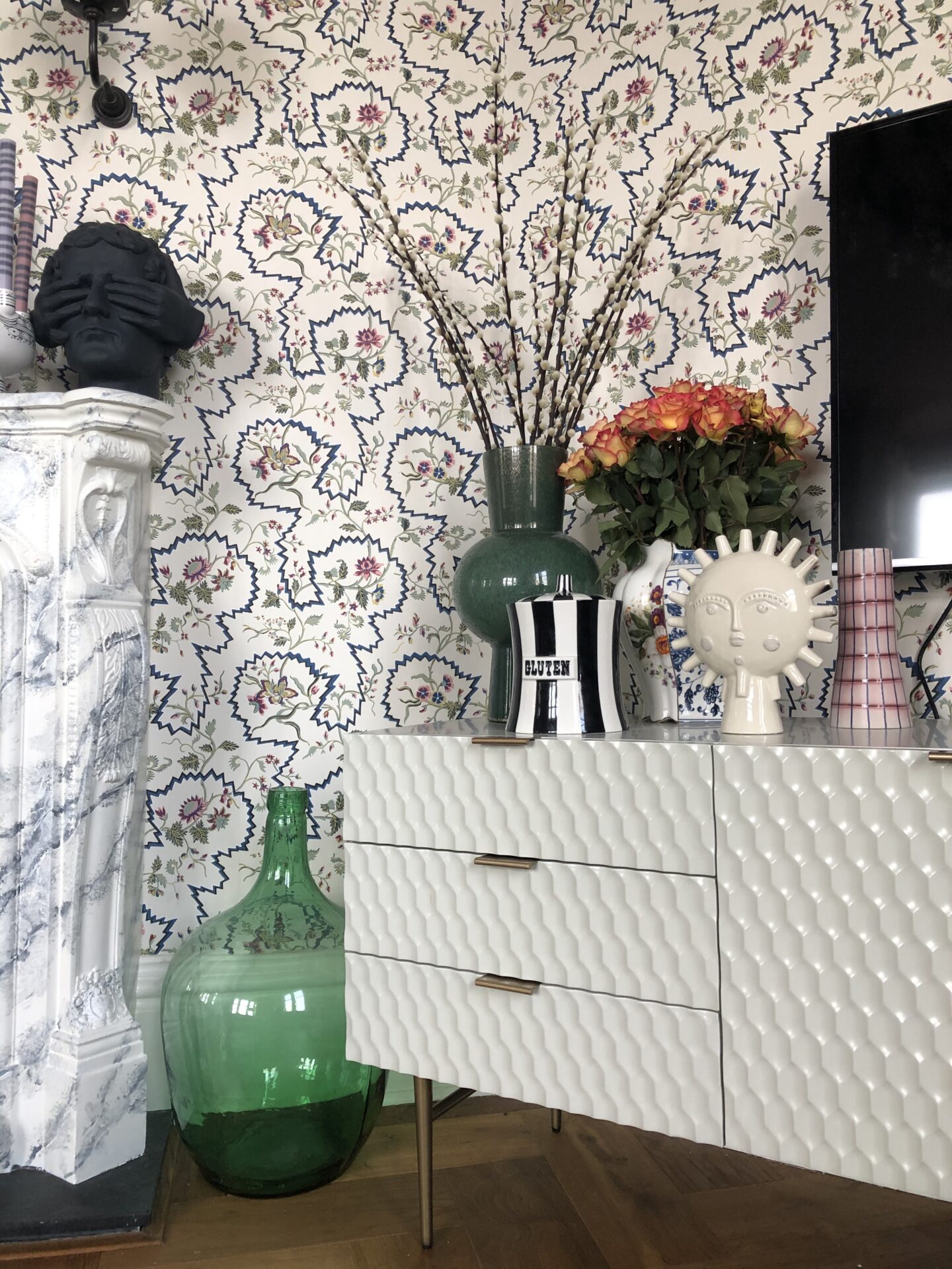
Media cabinet of dreams 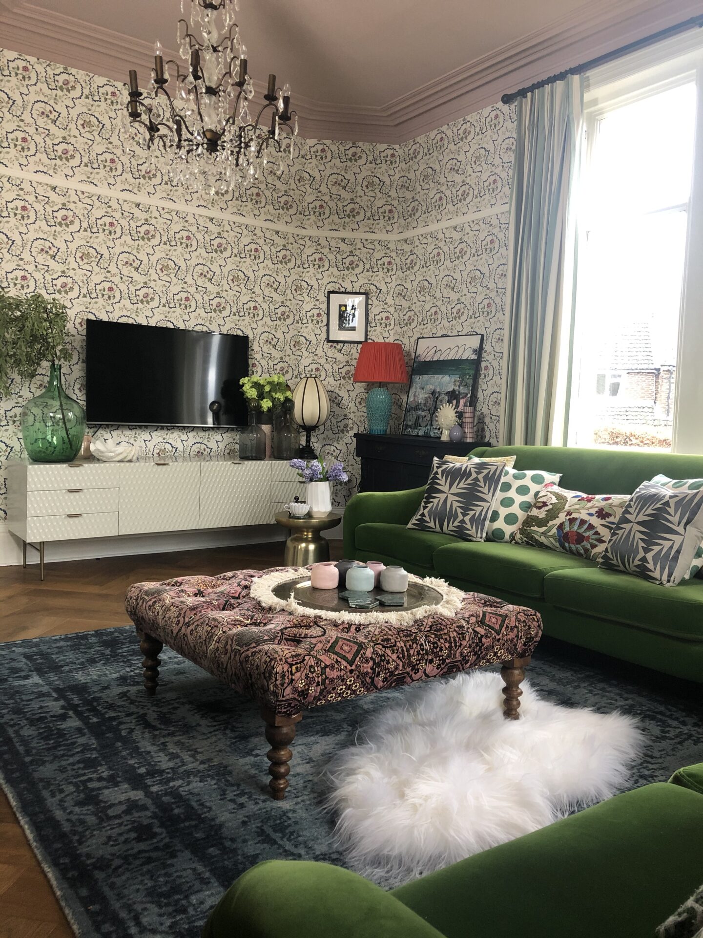
That pop of red…. 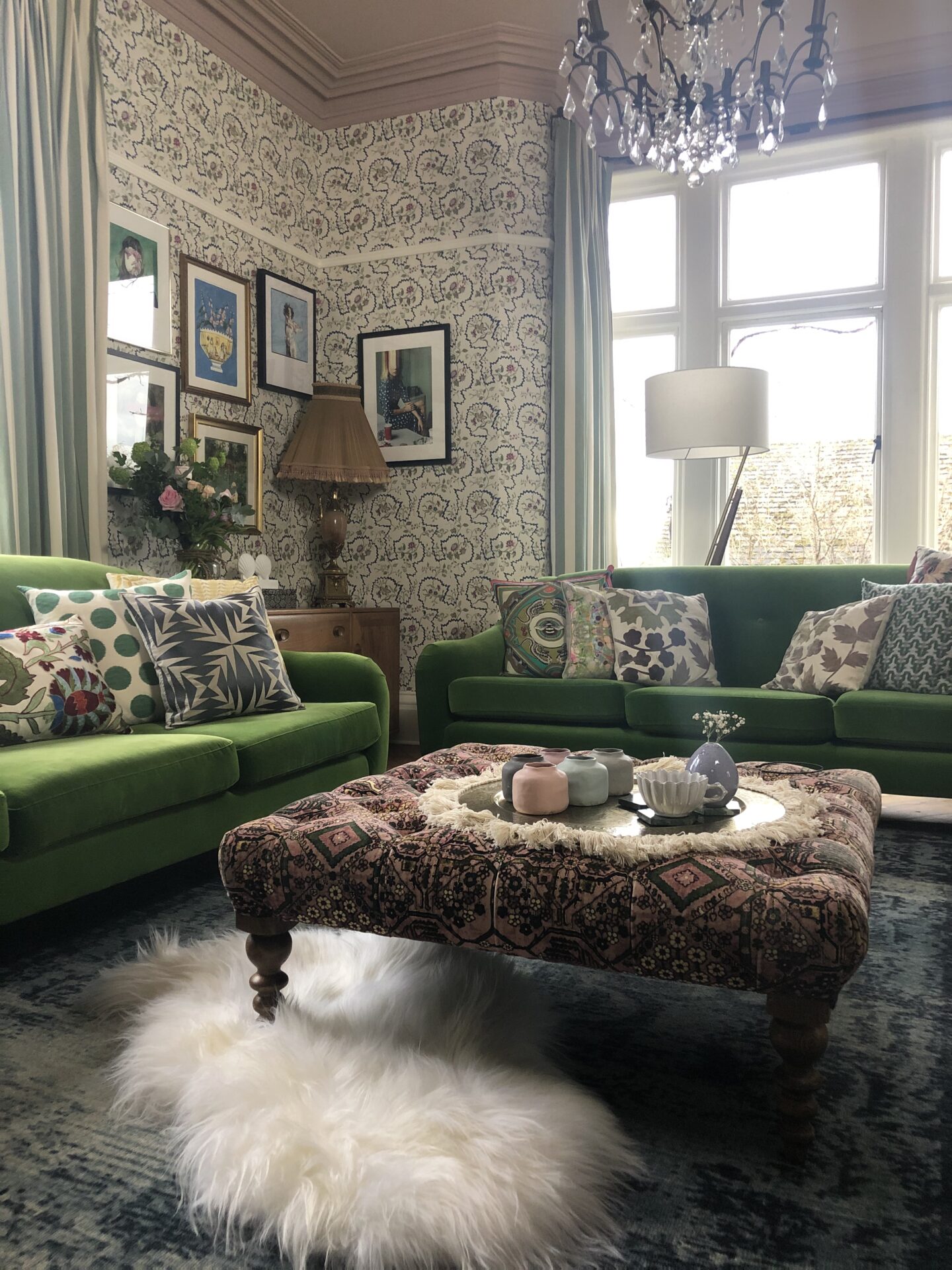
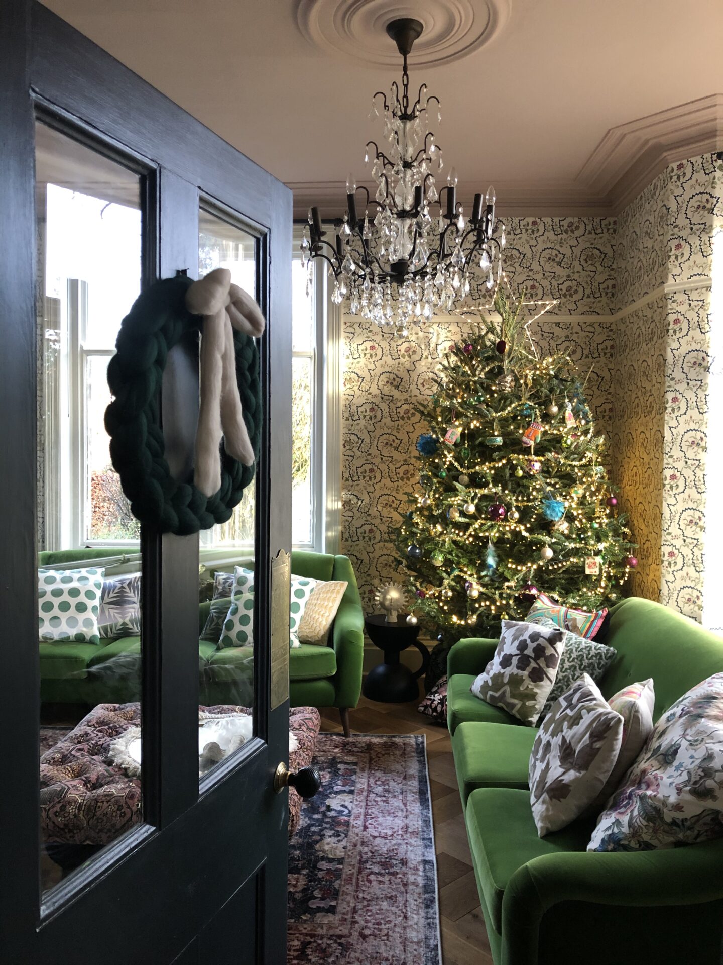
Its first Christmas… 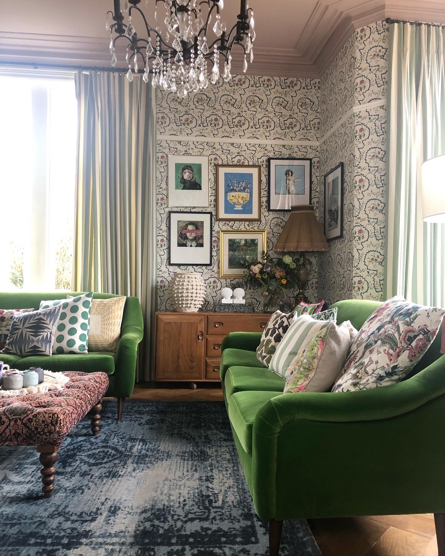
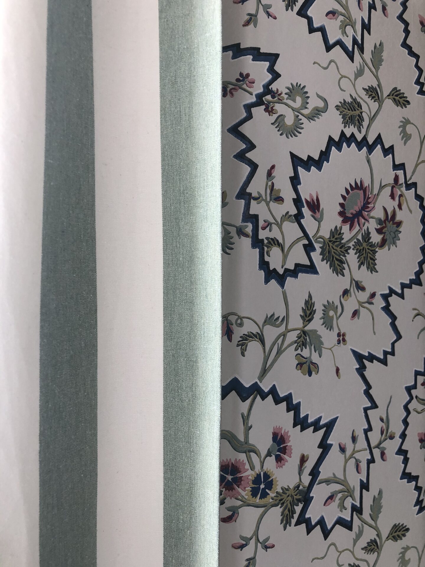
A stripe and a floral. Pleasing. 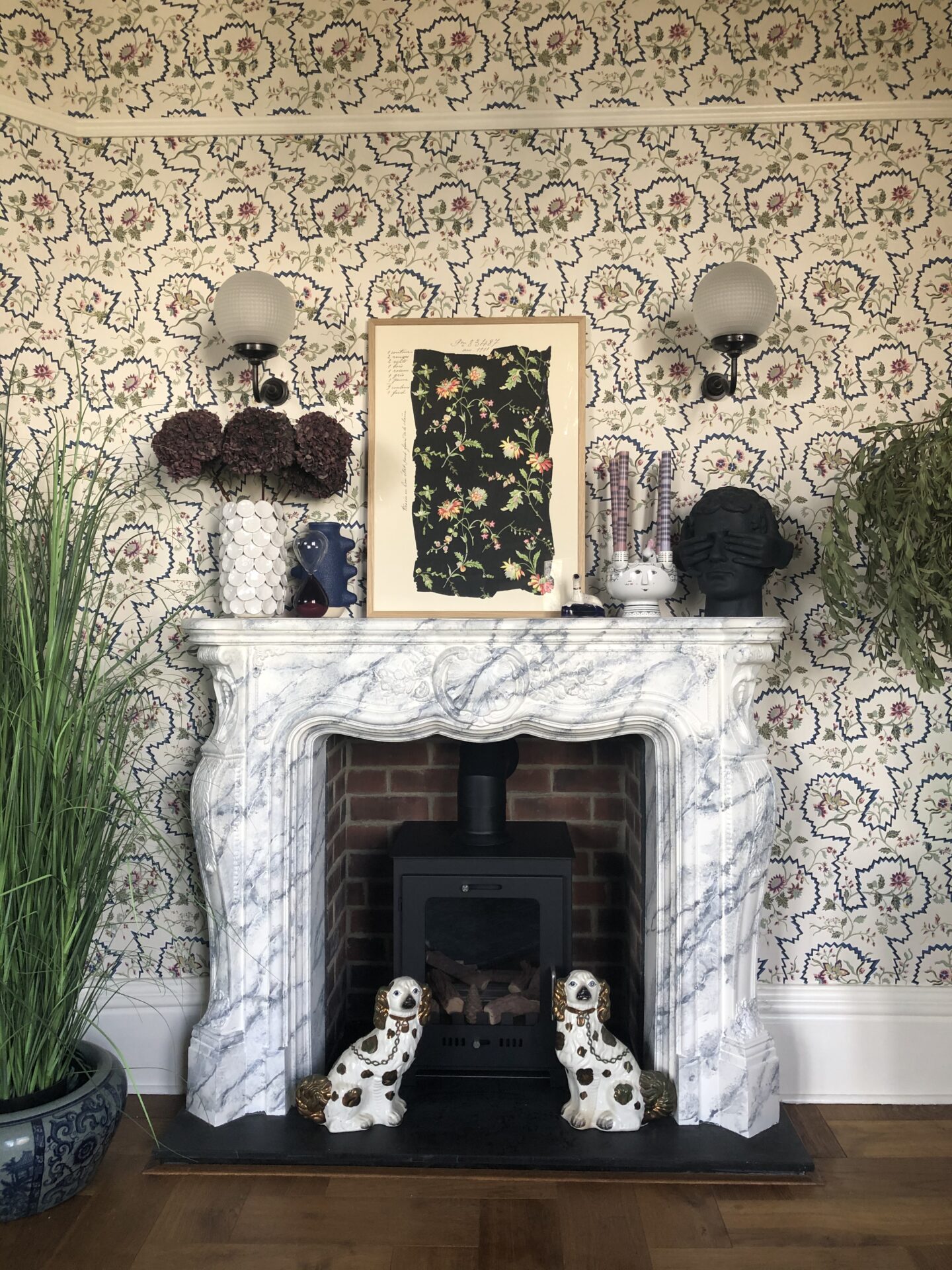
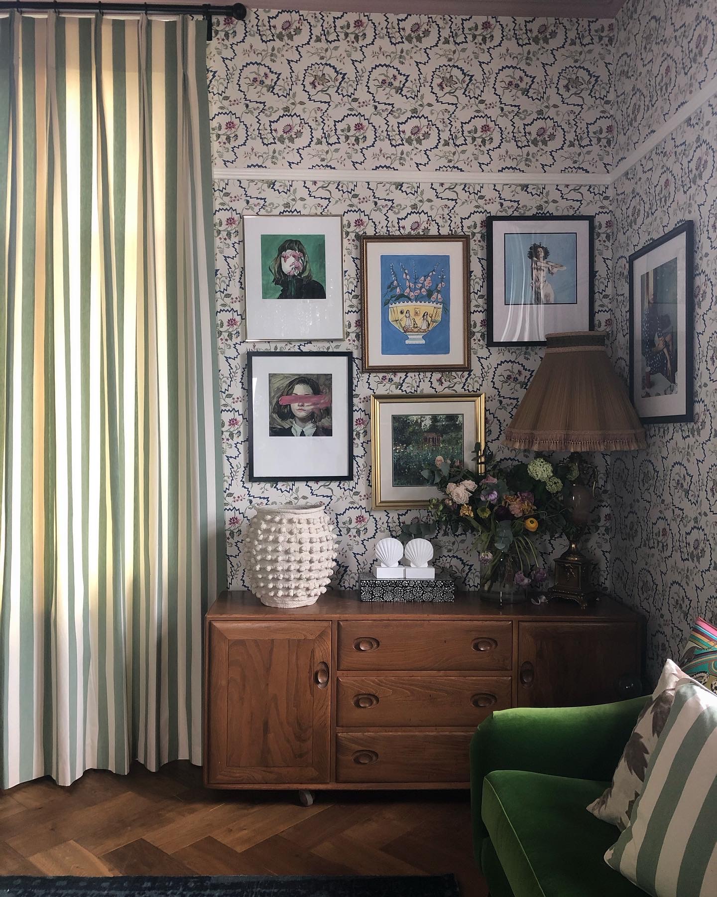
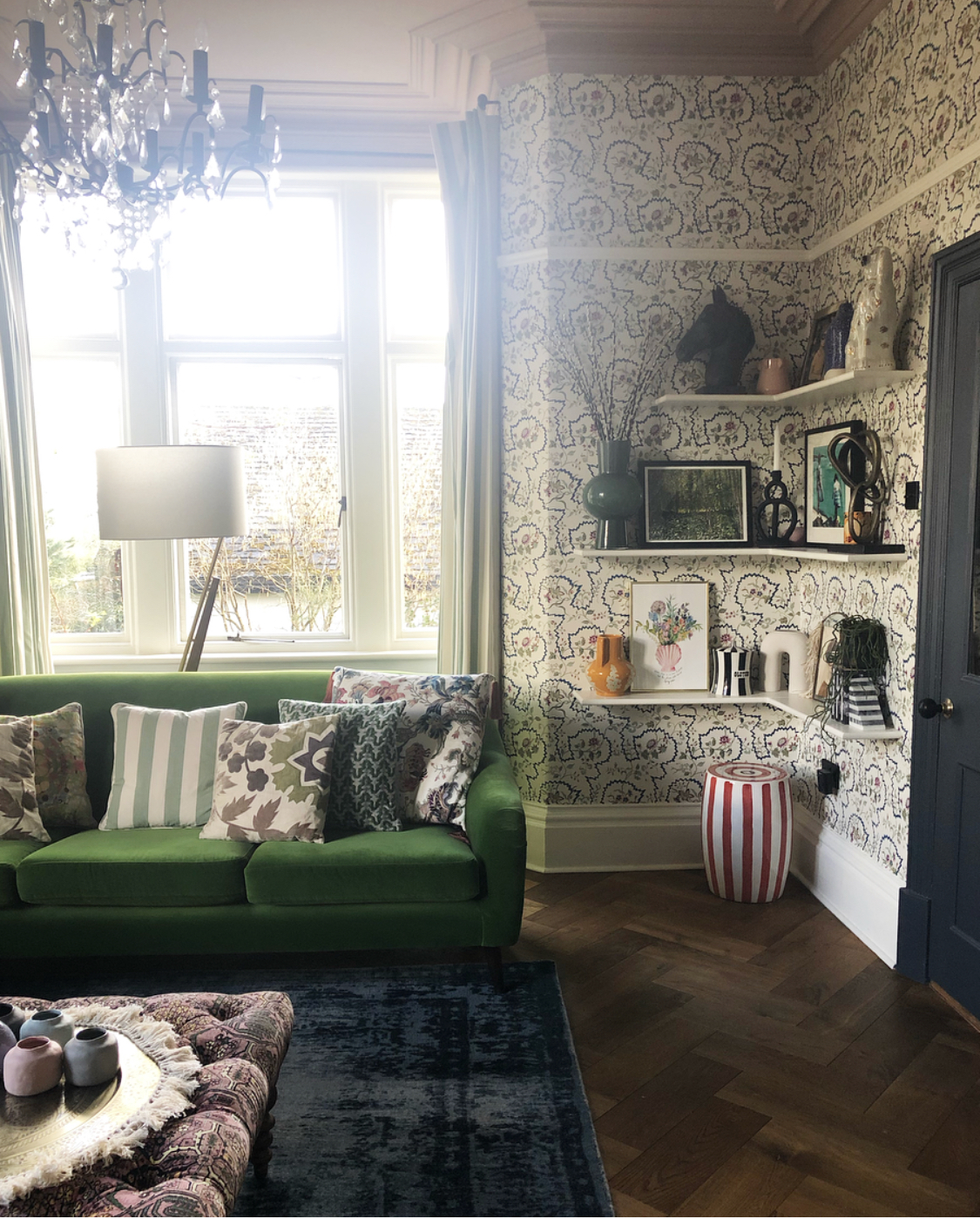
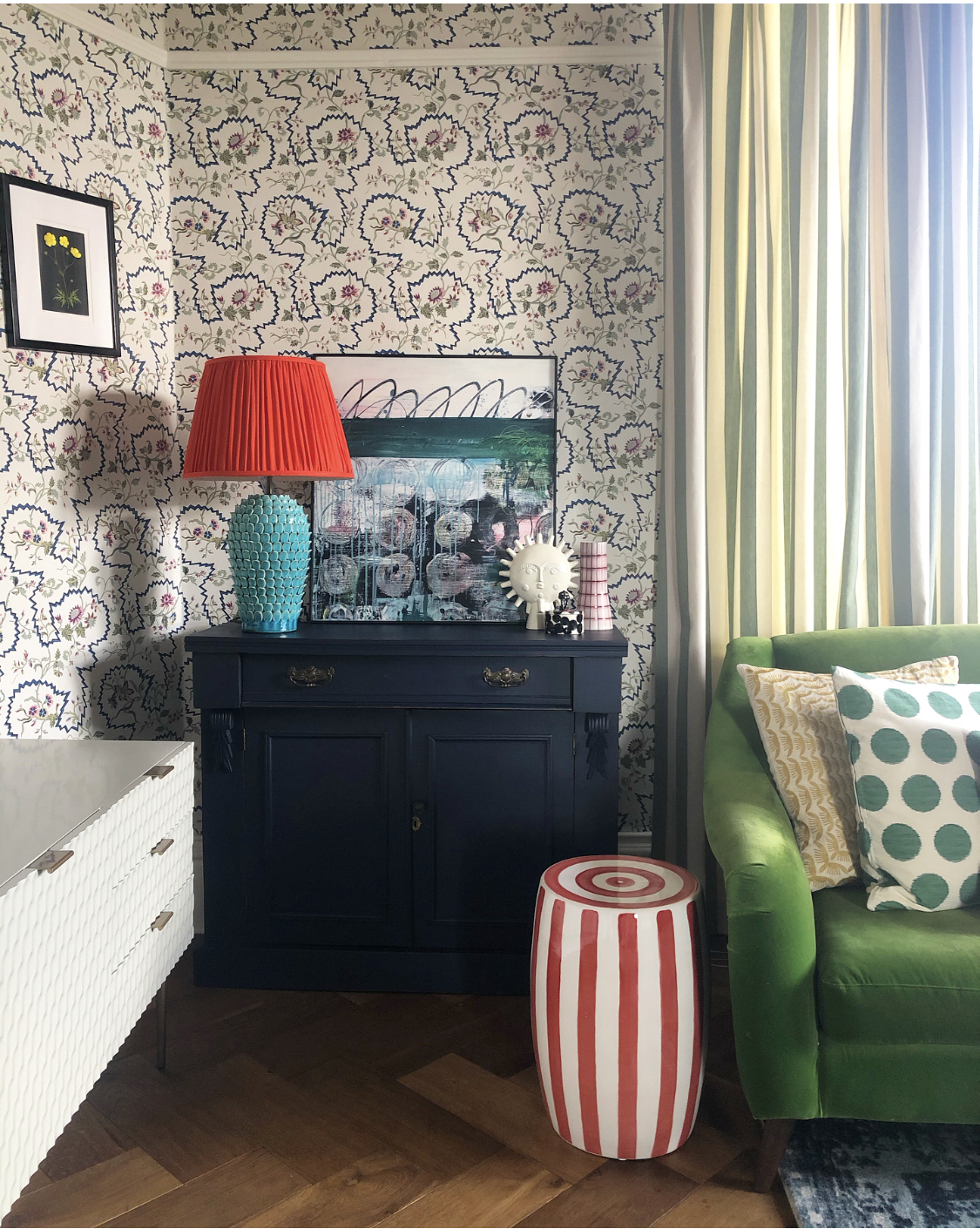
The Marcus Aitken piece from Murus Art, which I must hang. And the new red obsession.
Despite having a couple of moments early on of “what the very devil have I done” (I usually do, it sometimes takes me a while to settle with a scheme ?), I’m happy to confirm I now absolutely, unreservedly, love it. Now the darkness of the winter months is lifting, and the Spring light is creeping in, the room is coming into its own. Sometimes things just need a bit of time and space and they work themselves out. The jury is still out on the pink of the footstool, I feel like a different fabric would work better overall, but I haven’t found The One yet. I’ll give it time.
I’ll leave you with a video of the completed room. Join me in 2023 when I get itchy fingers once more….
I LOVE your green sofas. Perfect! x
Author
Thank you so much!
Oh my goodness, Sandra…. this is just amazing! What an undertaking!!!! Interior design is so fun! I consider my style as “decorating to excess”!!! I absolutely LOVE a great gallery wall!! It makes my heart happy!! One day, I envision my home with new paint, gorgeous appropriate furniture…. new windows!!! It’s quite the list! This 1903 Victorian is my dream home!!! I’m so ready to breathe new life into her!!! Your home is a treasure!!! Quite inspiring to me!! Blessings to you in this new and beautiful space!!!!
Becca
Author
You’re always so lovely Rebecca, you make my day 🙂 Thank you for reading x
Love what you’ve done with this room, truly inspiring! All the details are fantastic.
Author
Belated huge thanks, Allyson x
We’re about to wallpaper our dressing room in the blue version of this wallpaper. In the ‘flesh’ it is just gorgeous – without a doubt the most luxurious wallpaper I’ve seen. I love your mixing of brights, whites and modern art with the wallpaper.