When I look around my home, I see wallpaper. A lot of wallpaper. I have a definite type, and it always involves botanicals. Flowers, leaves, greenery, it all makes my heart beat faster, and almost every room in my house has been flower-bombed.
I’ve tried to pyschoanalyse why I’m so drawn to it, and I think it’s as simple as “I just like it”, which doesn’t make for a very groundbreaking blog, does it? There’s a lot to be said for bringing nature indoors, though. Are you familiar with “biophilia”? I wasn’t, until quite recently. It’s defined as “the innate human instinct to connect with nature”, and it’s a concept often used in interior design – bringing the outside in to our homes can reduce stress, and enhance our mood and wellbeing. We have the the intuitive and natural drive to connect with nature in our very DNA! So “I just like it” actually makes perfect sense.
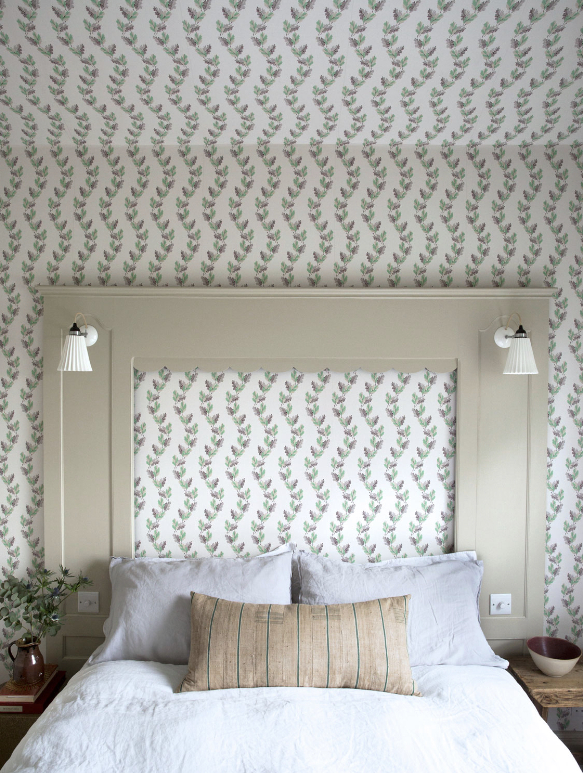
Of course, you can always turn your home into your own, personal jungle by bringing in houseplants. They’re quite high maintenance, though, and prone to going brown and crispy. Wallpaper is a lot more reliable. I always like to browse wallpaper anyway, as a bit of a hobby, but I’ve been looking in earnest over recent weeks as I’m hopefully going to be transforming the guest bedroom before too much longer. There are so many good designs out there. So many. I’m feeling particularly drawn to greenery for this room, and so I’ve put together the fruits of my labour. If you too are feeling the urge to green up your life, here are 6 wallpaper brands who give good greenery.
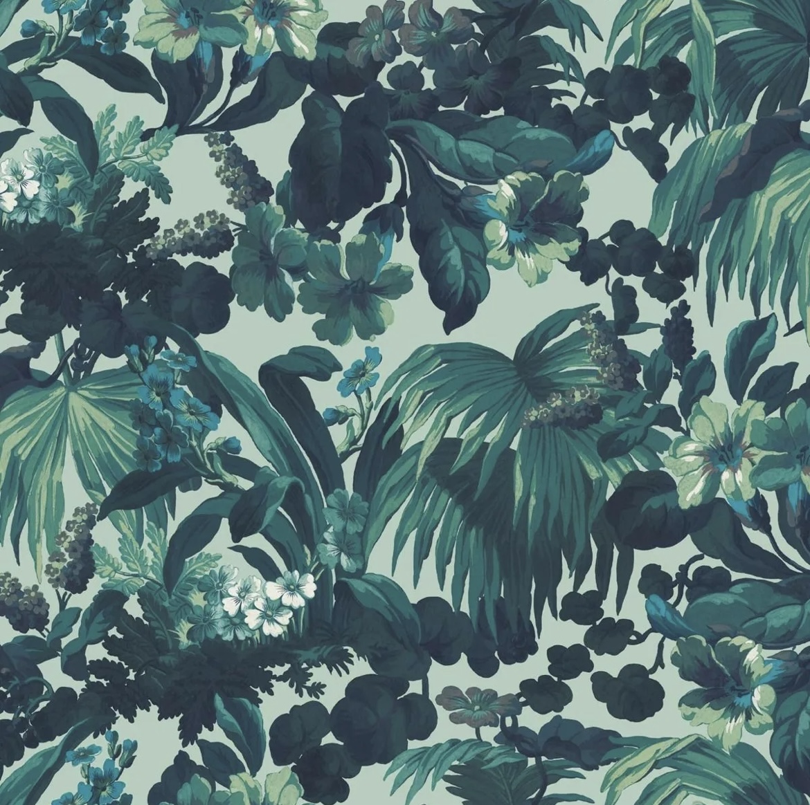
Living Quarters
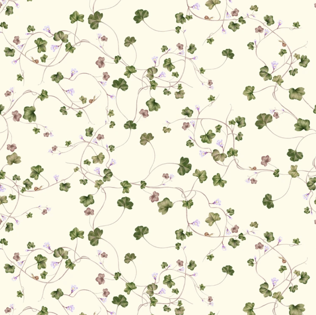
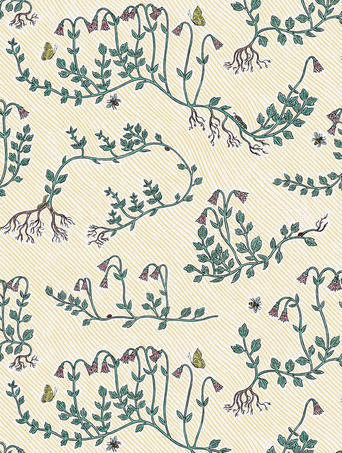
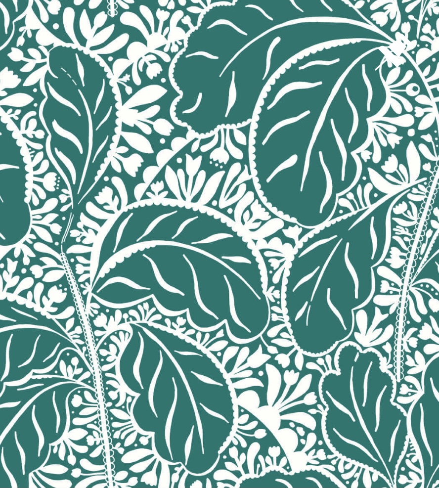
First up, I’ve discovered a couple of new-to-me indie wallpaper brands, one of which is Living Quarters. There’s relatively little information to be found about this London-based company online, but I know this: their small but perfectly formed collection is magical. I ordered samples and each one is a work of art, even more beautiful up close, with wildflowers, creeping vines and even a cheeky snail making an appearance.
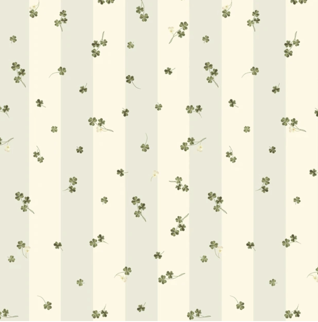
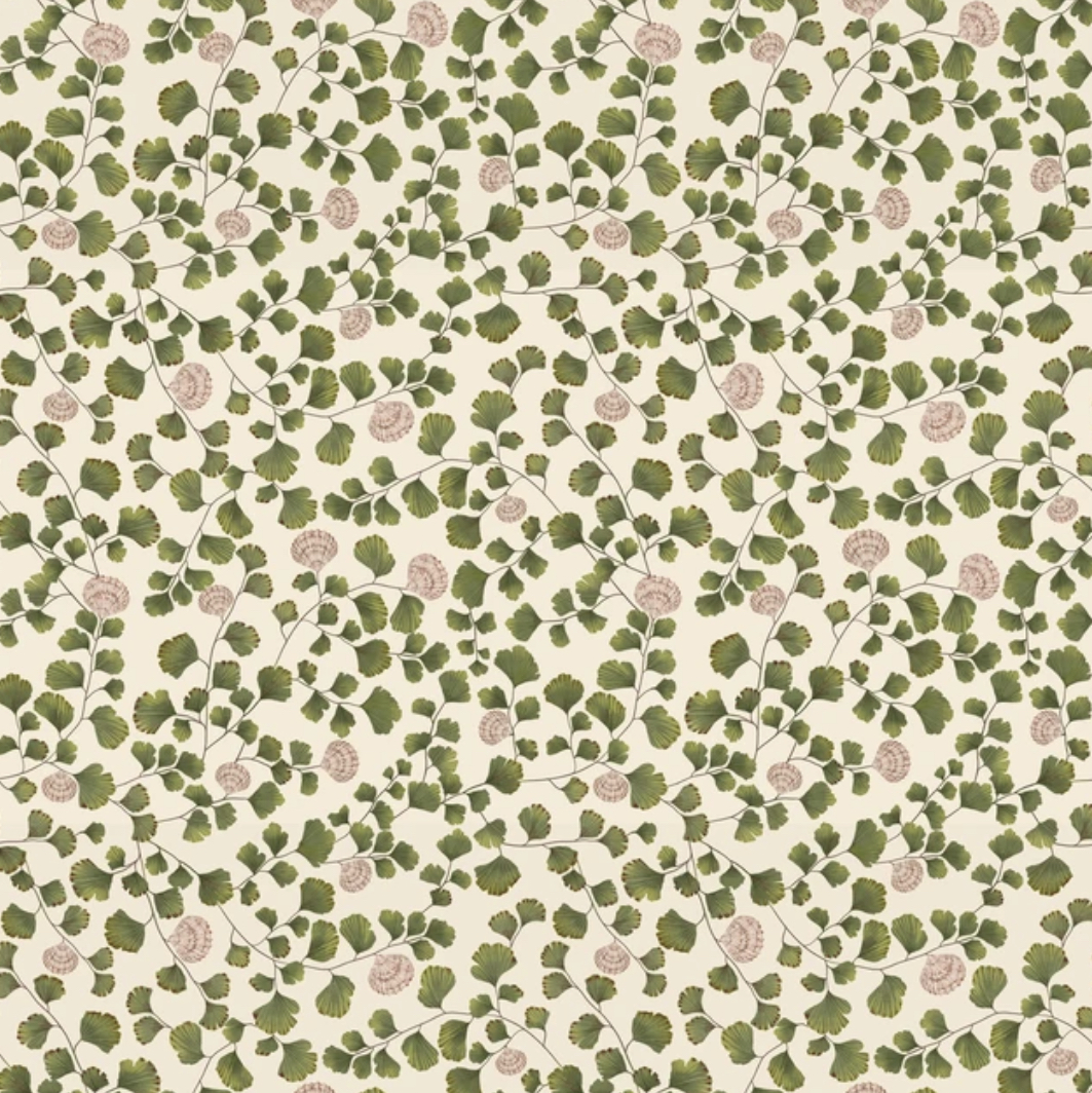
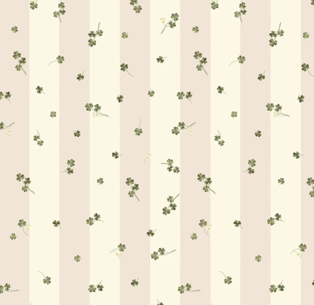
Top row, L-R: Meadow Clover (blue) – I adore the mix of clover with the subtle stripe (stripes and florals, or in this case, greenery, is never not an amazing combination), Creeping Toadflax – this is the design with some teeny baby snails hidden within the leaves, and Inflorescence – clusters of flowers giving a quintessential English countryside feeling.
Bottom row, L-R: Maidenhair – the maidenhair has scalloped leaves, much like a cockle shell, so Living Quarters combined the two, Meadow Clover (pink) – as above, but pinker, and Sibylla – named after Maria Sibylla Merian, a 17th century pioneering scientist, and probably my favourite of the bunch. One of the best wallpapers I’ve ever seen.
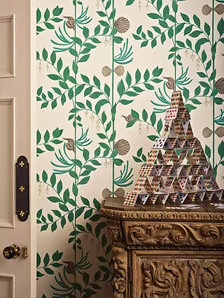
CommonRoom
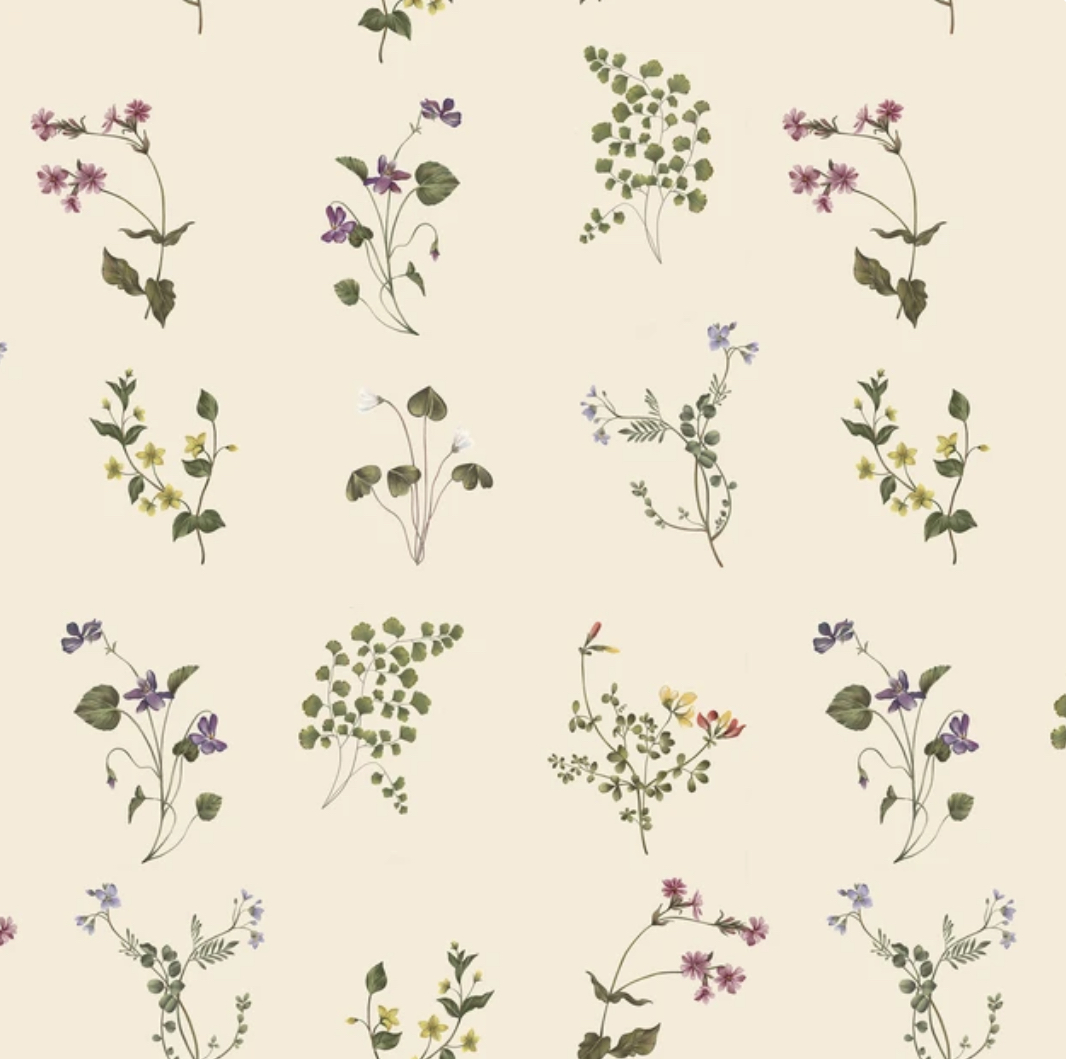
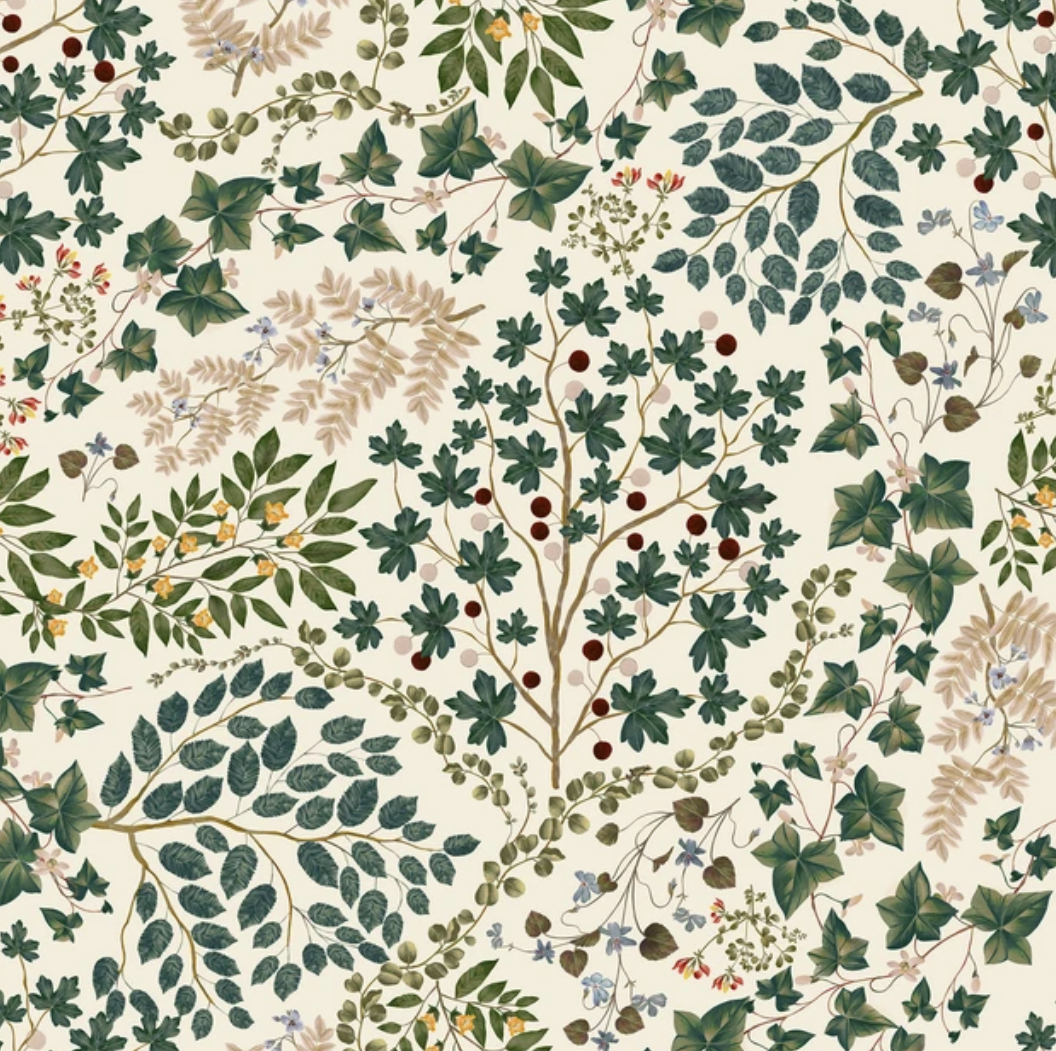
Another amazing indie brand, launched in 2014, whose mission is to make high quality art accessible to the many rather than the few, by commissioning original designs from contemporary artists, as well as producing an annual archival collection that commemorates the great history of artist wallpapers. Music to my ears! All of CommonRoom’s designs are absolutely worth checking out, but I’ve limited my selection to the botanical for this blog.
Top row, pics 1 and 2: Twin Flower by Fee Greening, which records the trajectory of life, from roots to wings – another floral with a pleasing and delicately striped background.
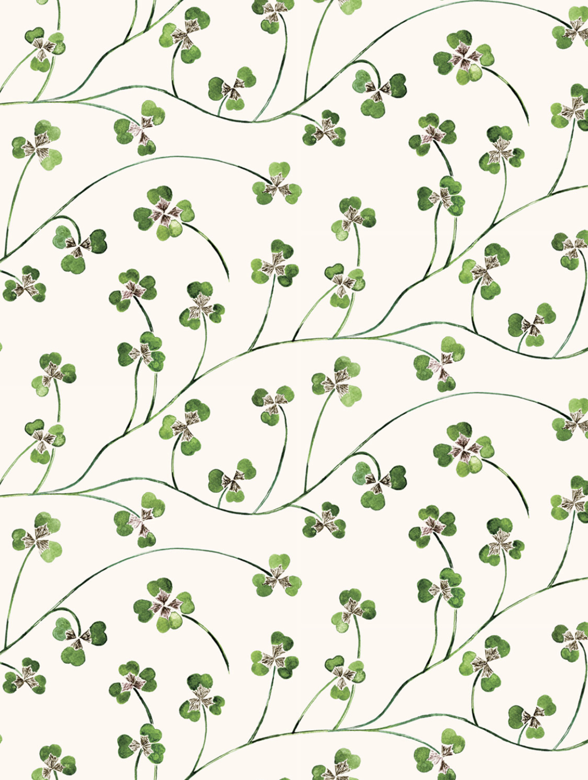
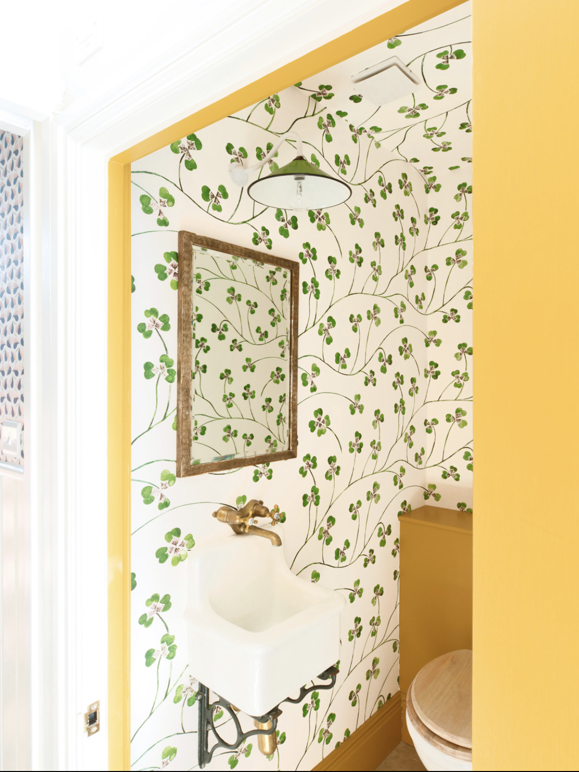
Top row pic 3 and bottom row pic 1: Lucky Leaf by Kate Hawkins – a beautiful clover design, available in a large or small scale print. This paper absolutely has my heart, it’s a very strong contender for the guest bedroom project. My brain is fizzing with ideas about how I could use it.
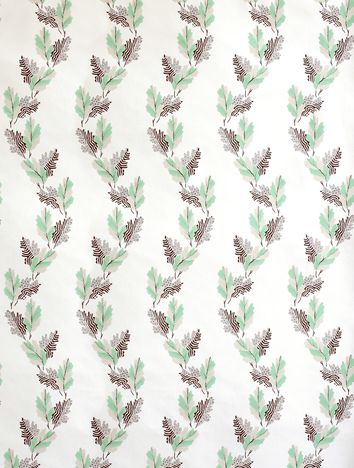
Bottom row, pics 2 and 3: Old Oak by William Kilburn – this design dates from 1800, and uses the English oak leaf, a motif woven into history and folklore, an ageless symbol of strength, honour and wisdom. I usually veer towards wilder, less symmetrical patterns in the papers I choose, but I find the repeat here very pleasing indeed.
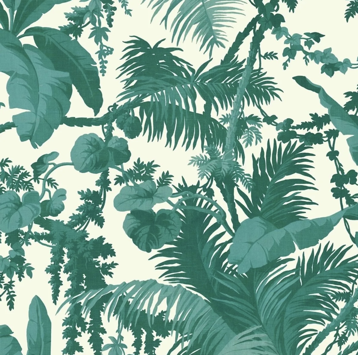
Cole & Son
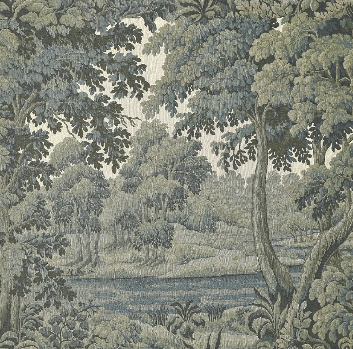
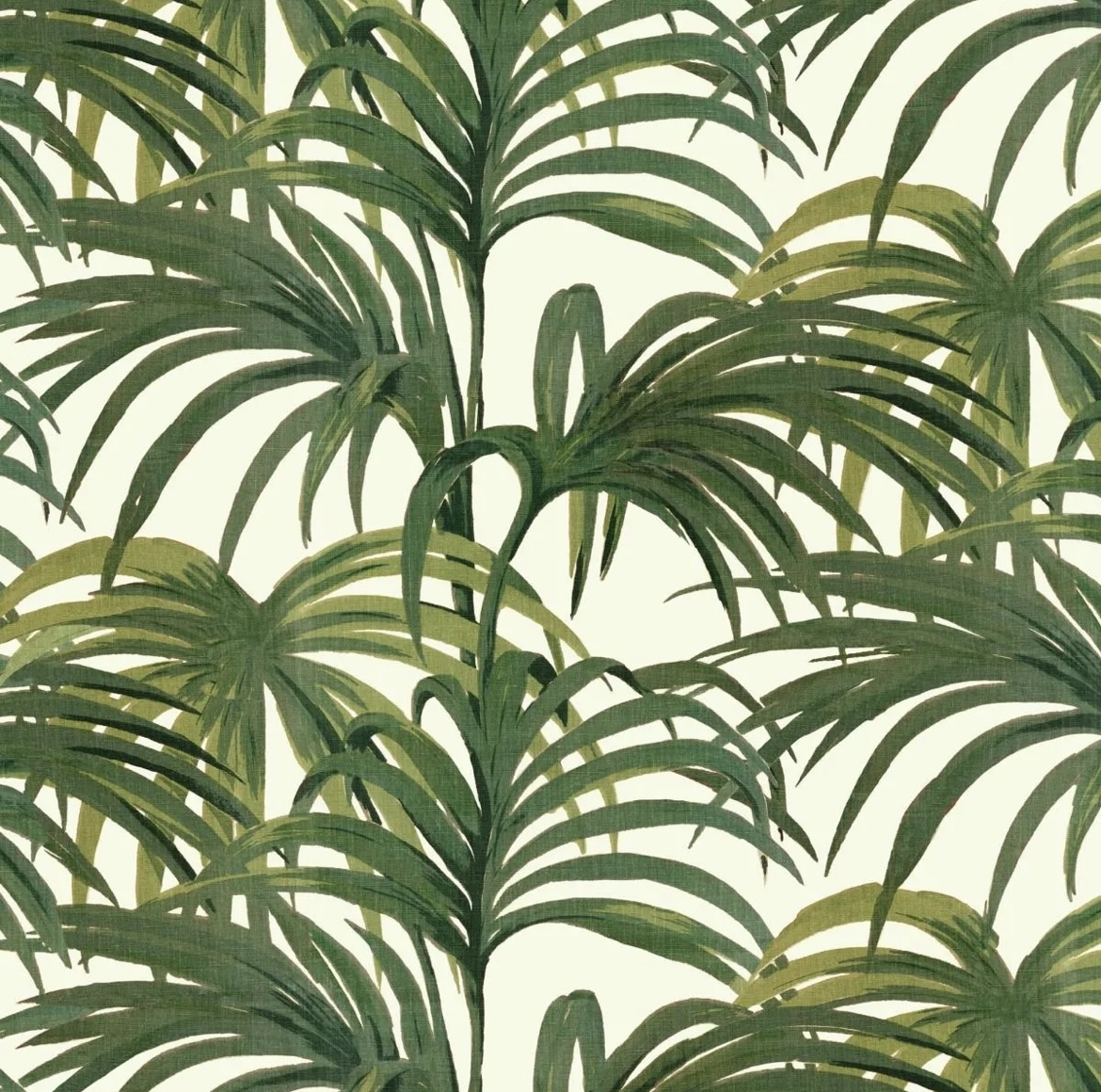
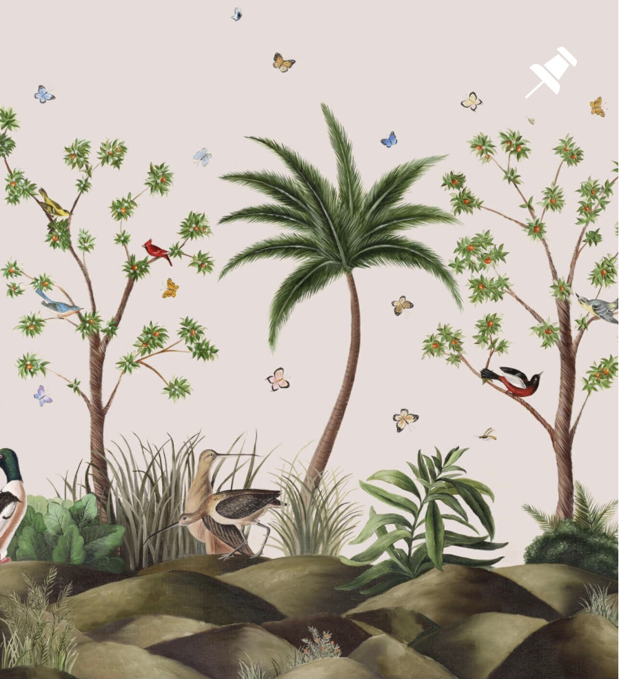
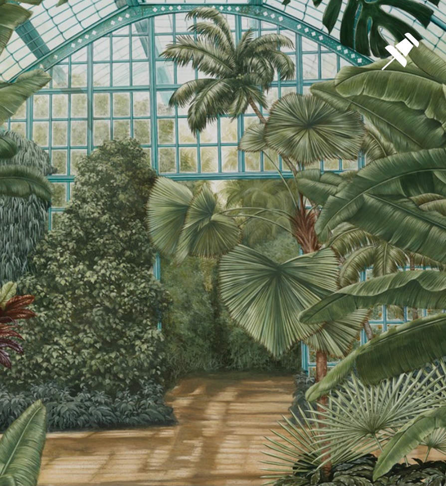
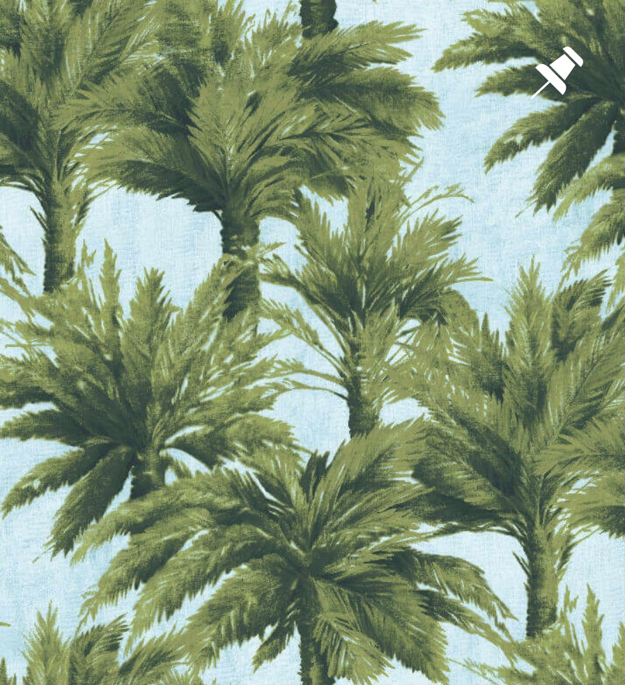
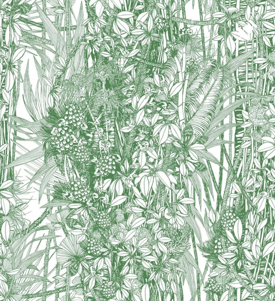
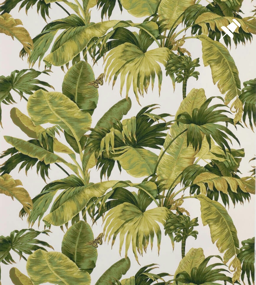
When I bought my first house in 2003, I loved wallpaper just as much as I do now, and my go-to brand was British stalwart, Cole & Son (I had their Orchid paper in my living room, Hummingbirds in the spare room and Cow Parsley in the dining room, and I still love them all today. I’m loyal.). The London-based company has a long and impressive history in wallpaper design and its back catalogue of designs covers the 18th, 19th and 20th centuries. Unsurprisingly, their huge range includes some excellent greenery-based options, from exotic palms to lush ferns. My favourites are always the papers drawn from the British countryside, as opposed to the tropical ones (I’m more of a ‘walk-through-a-forest’, than a ‘lie-in-the-sun-under-a-palm’ sort of person, but there are no bad options here.
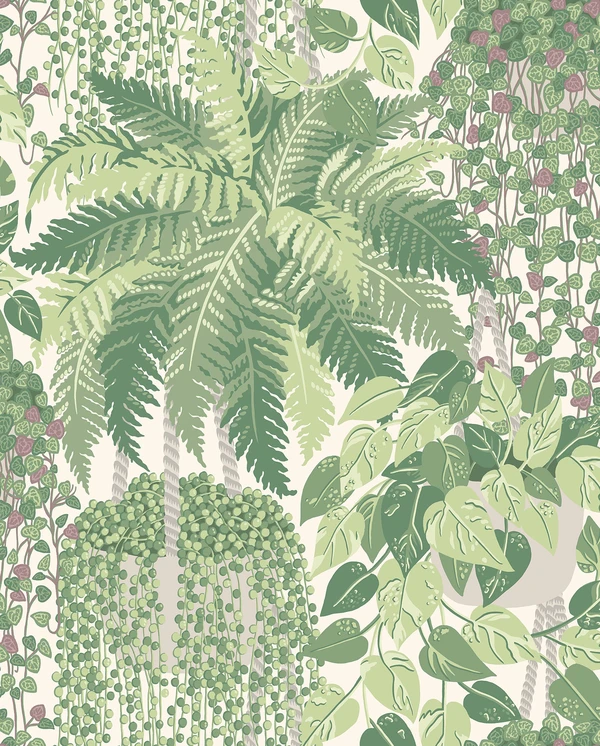
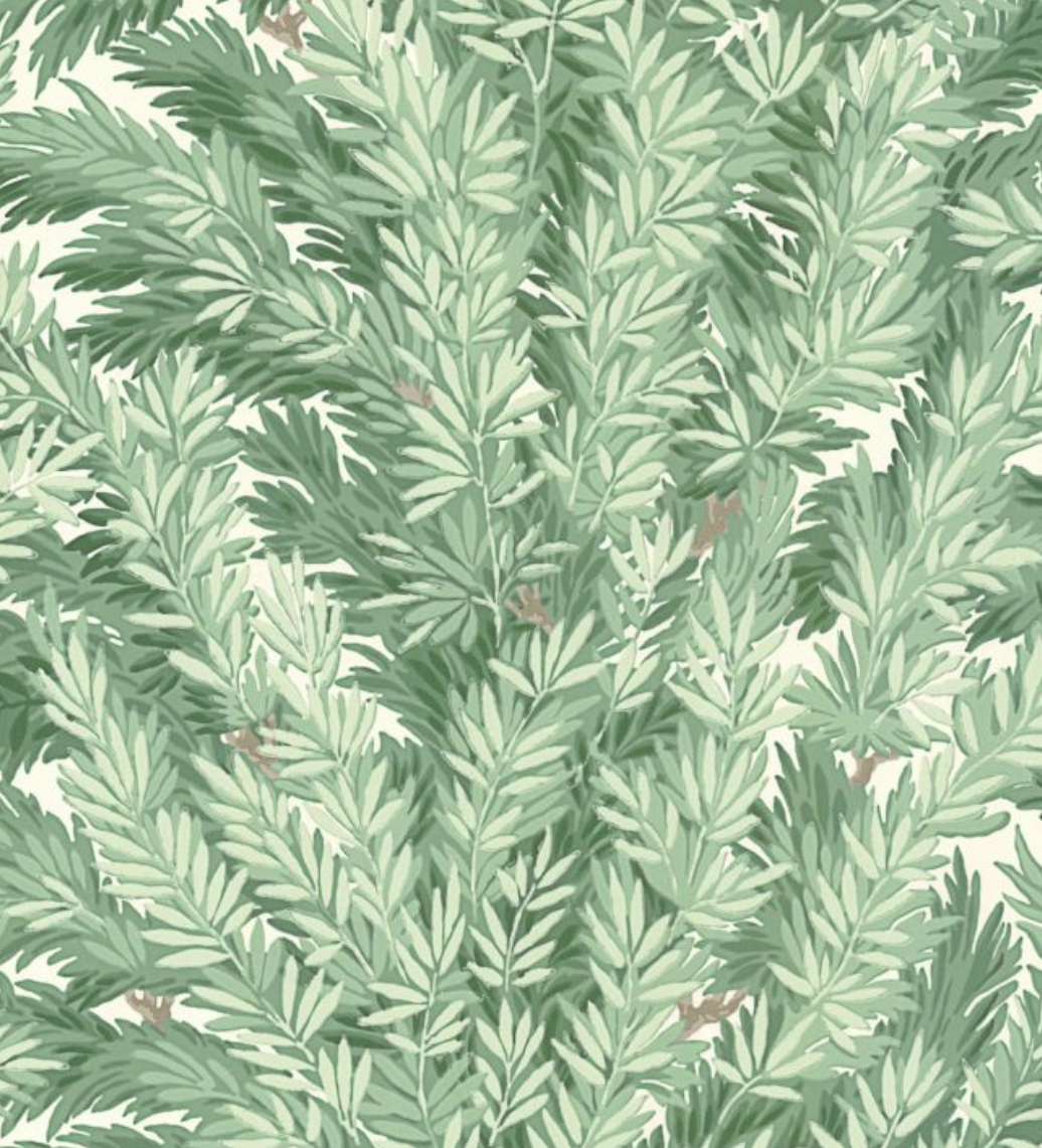
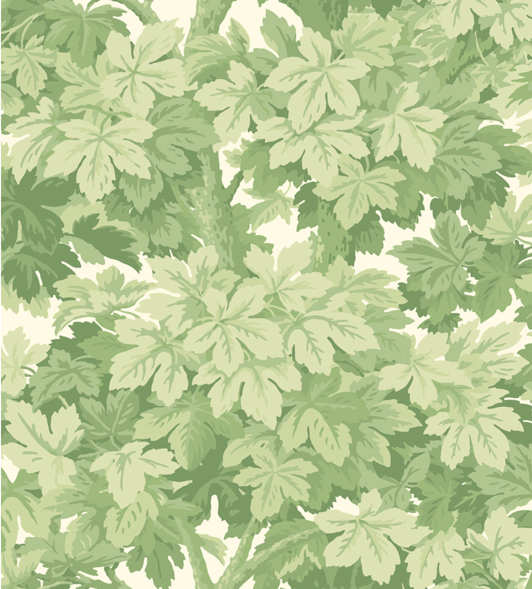
Top row, L-R: Secret Garden, Fern, Florencecourt.
Middle row, L-R: Hollywood Palm, Palm Leaves, Great Vine (this one seems to be out of stock everywhere, alas).
Bottom row, L-R: Chiavi Segrete, Royal Fernery.
I won’t go through each paper here, but will simply say that, of this selection, I would use Secret Garden, Florencecourt, Chiavi Segrete and Great Vine in a heartbeat. They have the lush, British countryside feeling that makes my heart sing. Perfect.
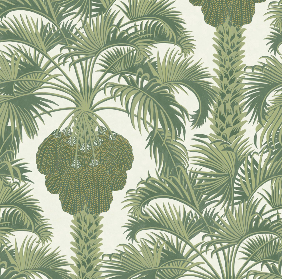
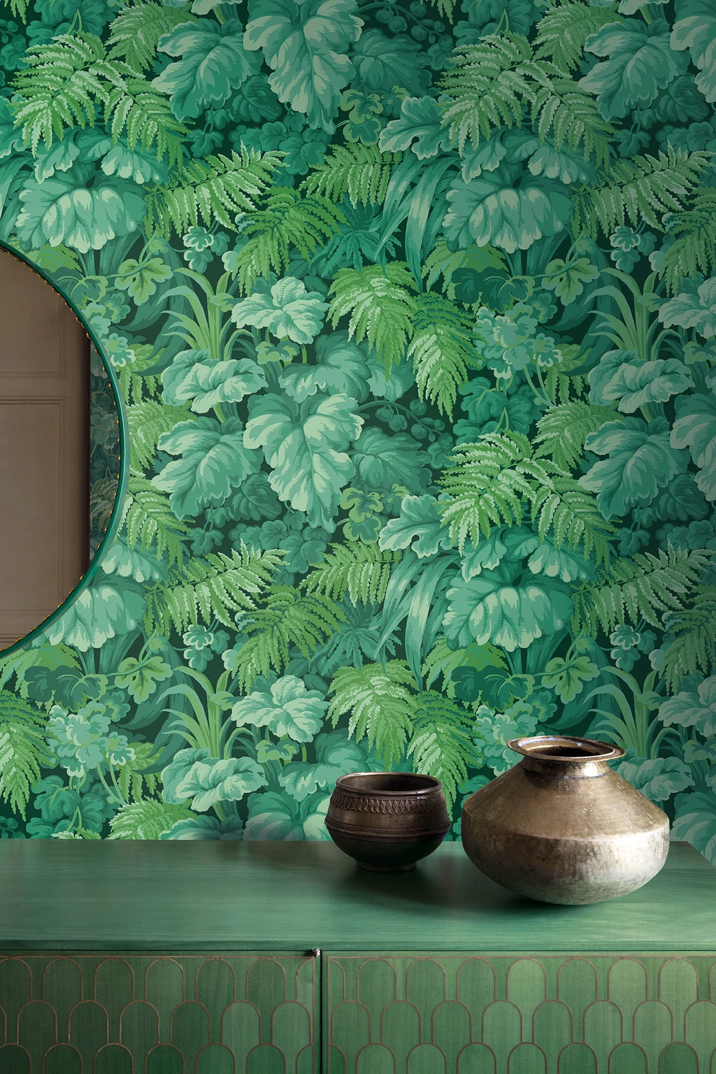
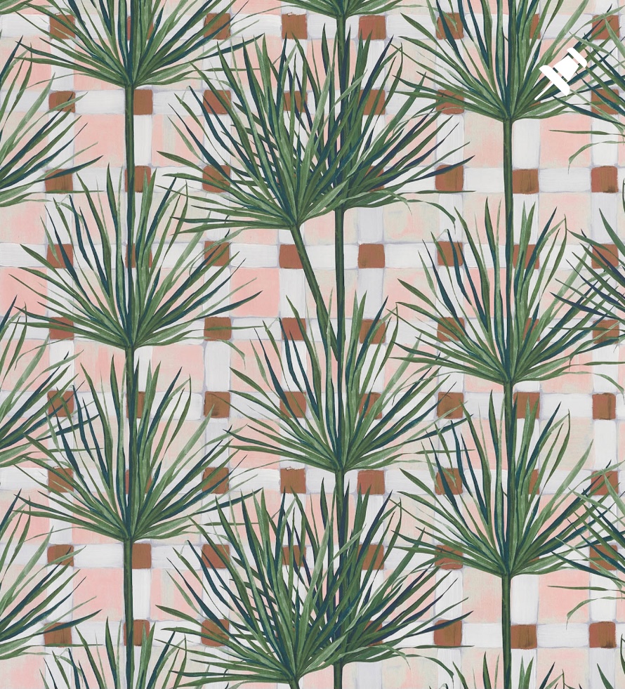
House of Hackney
It’s no secret that House of Hackney is one of my favourite wallpaper brands. Rarely have I felt the pattern-based excitement I felt when I first came across them a few years back. Remember those banned adverts for Tango in the early 90s, where a chubby, orange man in pants, slapped someone round the face to indicate the very exciting orangeness of Tango? That’s how I felt when I saw House of Hackney’s work for the first time. There’s a whole lot of their modernised William Morris “Artemis” print in my house, and the brand draws heavily on nature for its unique designs. The colours used by House of Hackney in their designs give me such joy, and here is my pick of their greens:
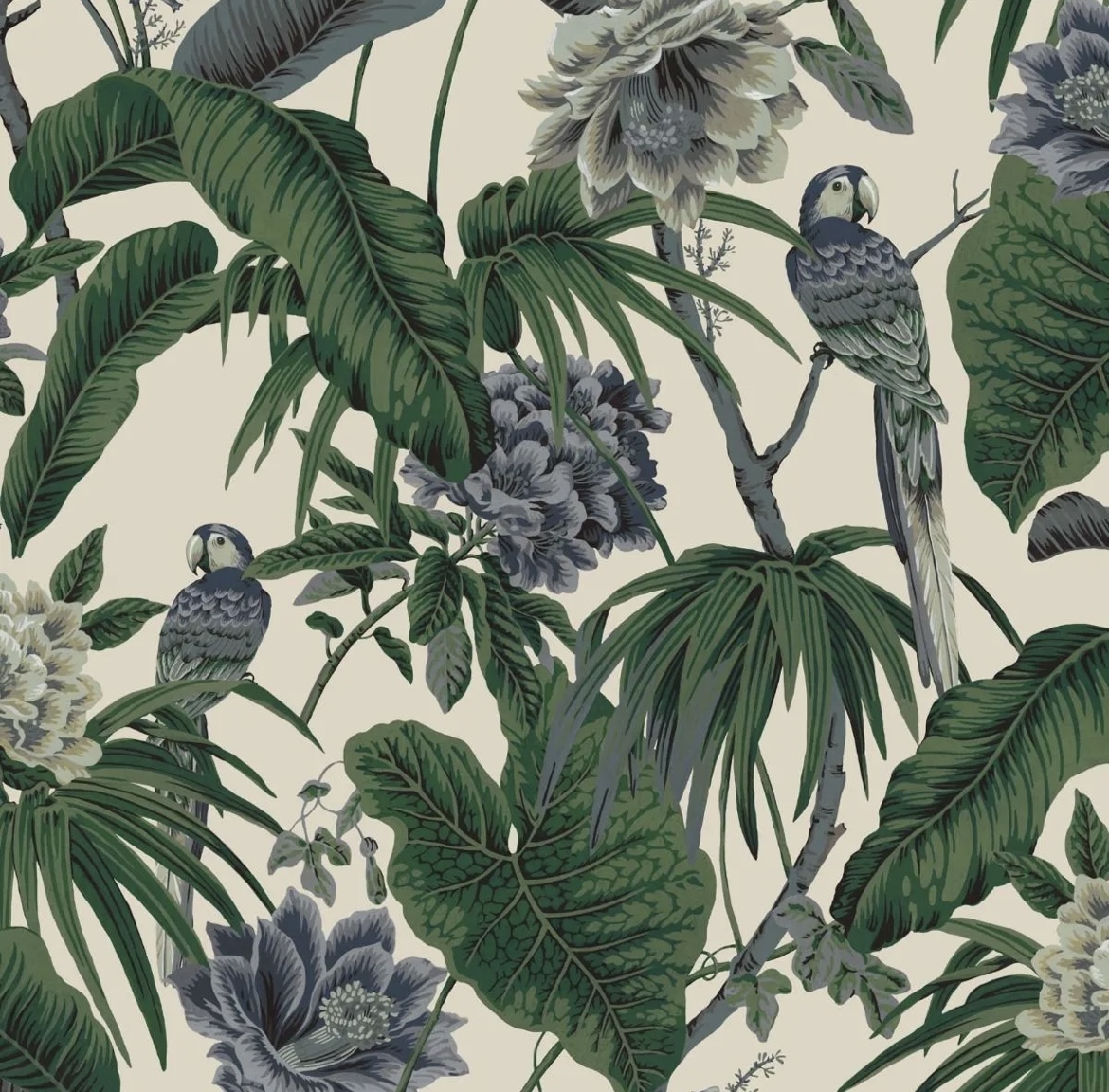
Top row, L-R: Plantasia, Palmeral, Babylon.
Middle row, L-R: Limerence, Paradisa, Bambusa.
Bottom row, L-R: Tarovine, Pampas.
Palmeral is probably House of Hackney’s most iconic paper, often copied, but never bettered, in my opinion. It was inspired by Loddiges, one of the world’s largest palm houses, based in Hackney (not a place I’d readily associate with palms, to be fair) in the Georgian period.
Of my selection, my two favourites are Babylon (inspired by 1950s Palm Springs, with willow boughs in an iconic Art Deco design), and Paradisa (inspired by 1930s Chinoiserie, a modern take on tropicalism). As well as bringing beautiful greenery into our homes, House of Hackney also has great eco credentials, and purchases and protects 35m2 of forest for each roll sold, in partnership with the World Land Trust. Bravo.
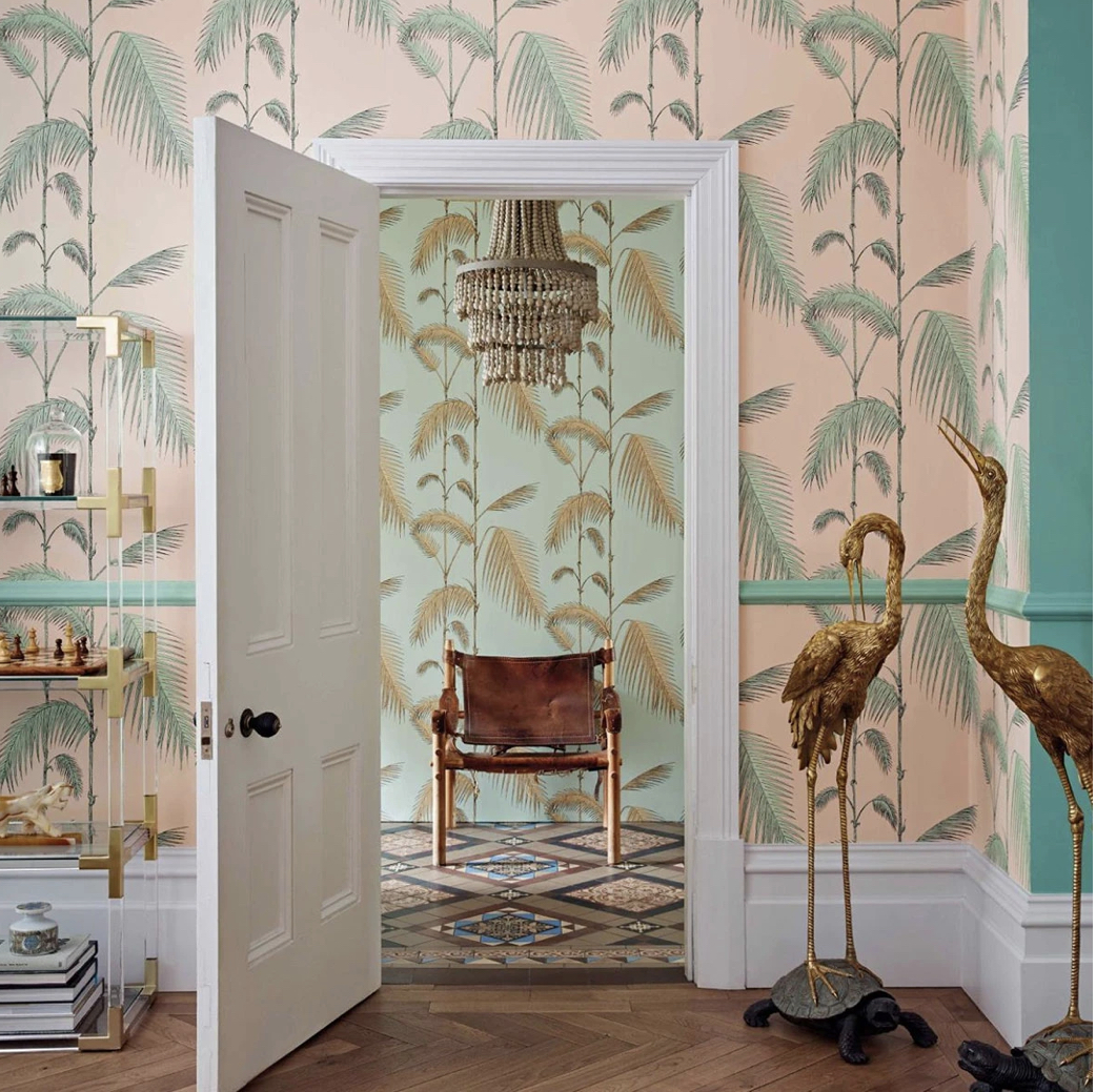
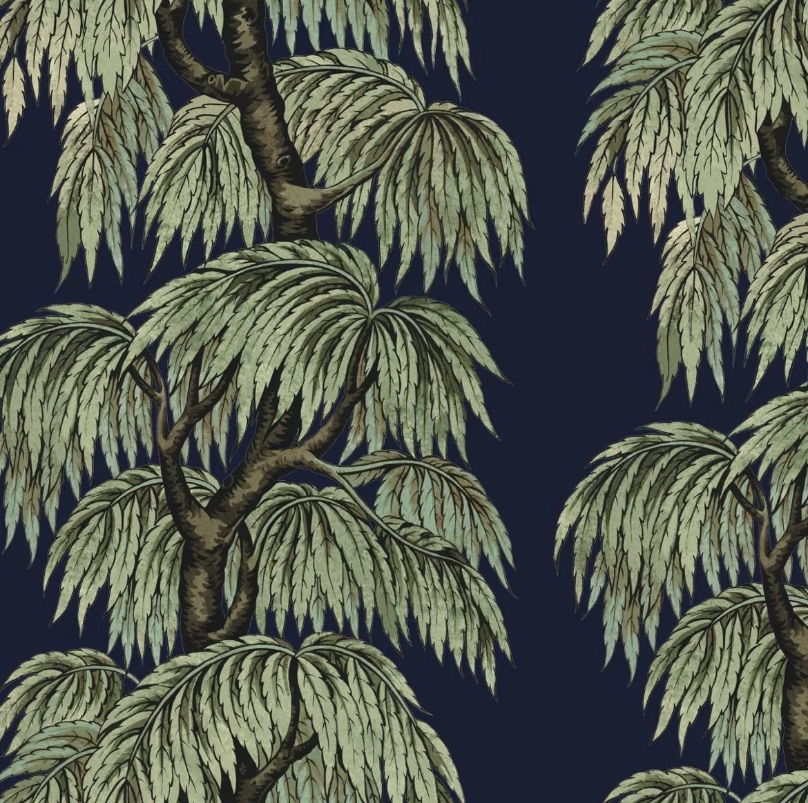
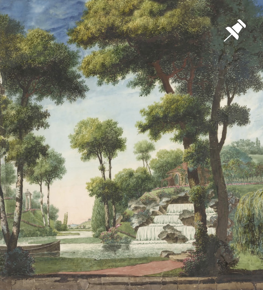
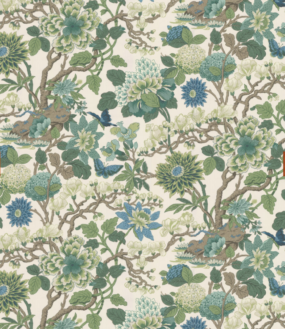
Maison Pierre Frey
From a British stalwart (I love the word “stalwart”), to a French one. Maison Pierre Frey was founded in 1935, and remains a family business with “a love of work well done, careful attention to detail and inspired creation”. Very good loves to have. I used a Pierre Frey wallpaper (La Pannonie) in my living room last year (see it here), and it was absolute love at first sight when I saw the sample – this is always the strength of feeling I need before I can commit to a paper, and Pierre Frey inspire it often. Their designs are not ones you’ll see in the homes of every man and his dog, they’re detailed, unique and rather special. Some have very mural-esque qualities (see here for my blog on why wall murals are wonderful). Here is my pick of the green offering:
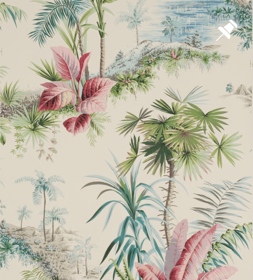
Top row, L-R: Amazonia, Japonicium Pastel, Monteverde.
Second row, L-R: Canaima Original, Le Parc, La Serre Palmier.
Third row, L-R: Mauritius Ciel, Bananas Jade, Amazone Chlorophylle.
Fourth row, L-R: Espalier Prairie, Cuilko Jade, Bananier Olive.
Bottom row: Alexandrie Begonia, Patio Exotique Roussillon.
We’ve got greenery in every form here. I particularly love the painterly Amazonia, the exotic, vintage-style palms and orange trees of Canaima and, in the number one, hit-me-in-the-heart, spot, Espalier Prairie. Again, this one is more of a formal, symmetrical repeat than I’m usually drawn to, but there’s something magical about it to me – the different foliage on one imaginary arbour is simply delightful. I would really, really love to use this somewhere, chez Baker.
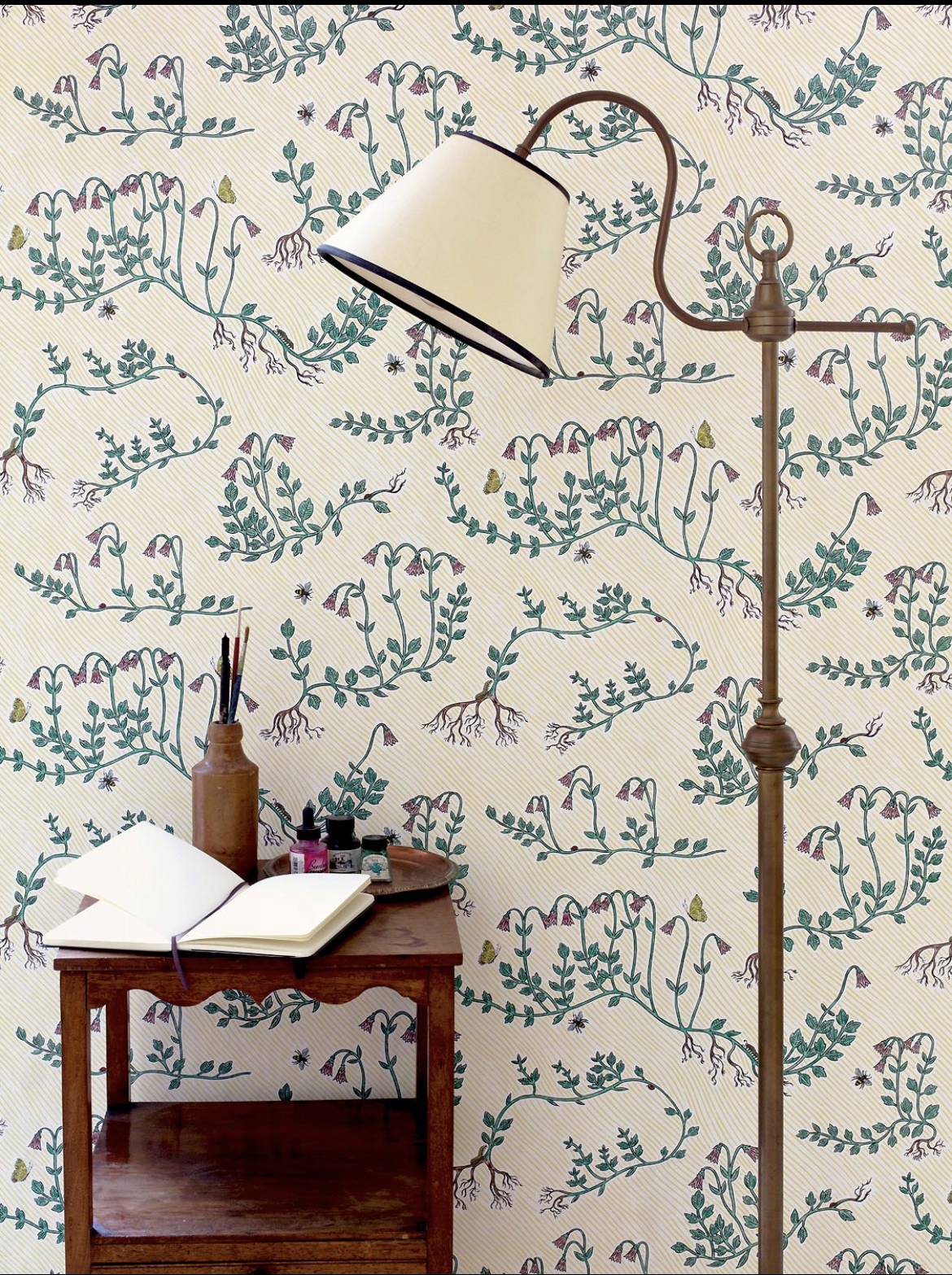
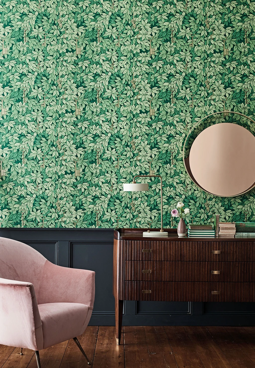
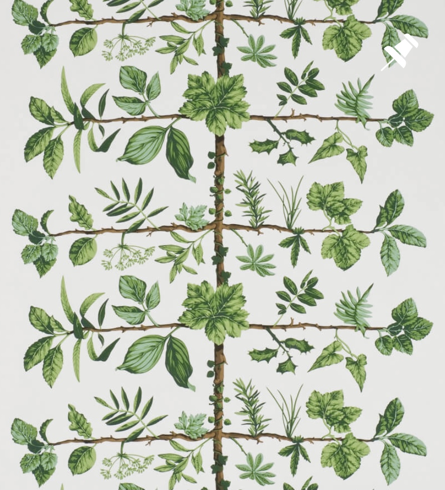
GP&J Baker
Back to Blighty to complete my round up, with another trusted and time-served brand, GP&J Baker (no relation). The company was founded in 1884, and has held the Royal Warrant since 1982. If it’s good enough for Her Madge, not that her style is one I’d tend to base my own on, I must add, then you know it’s got quality in its very core. Here are their Good Greens:
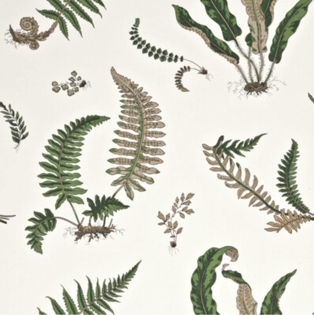
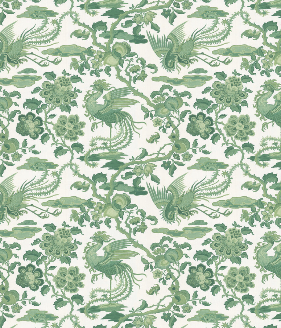
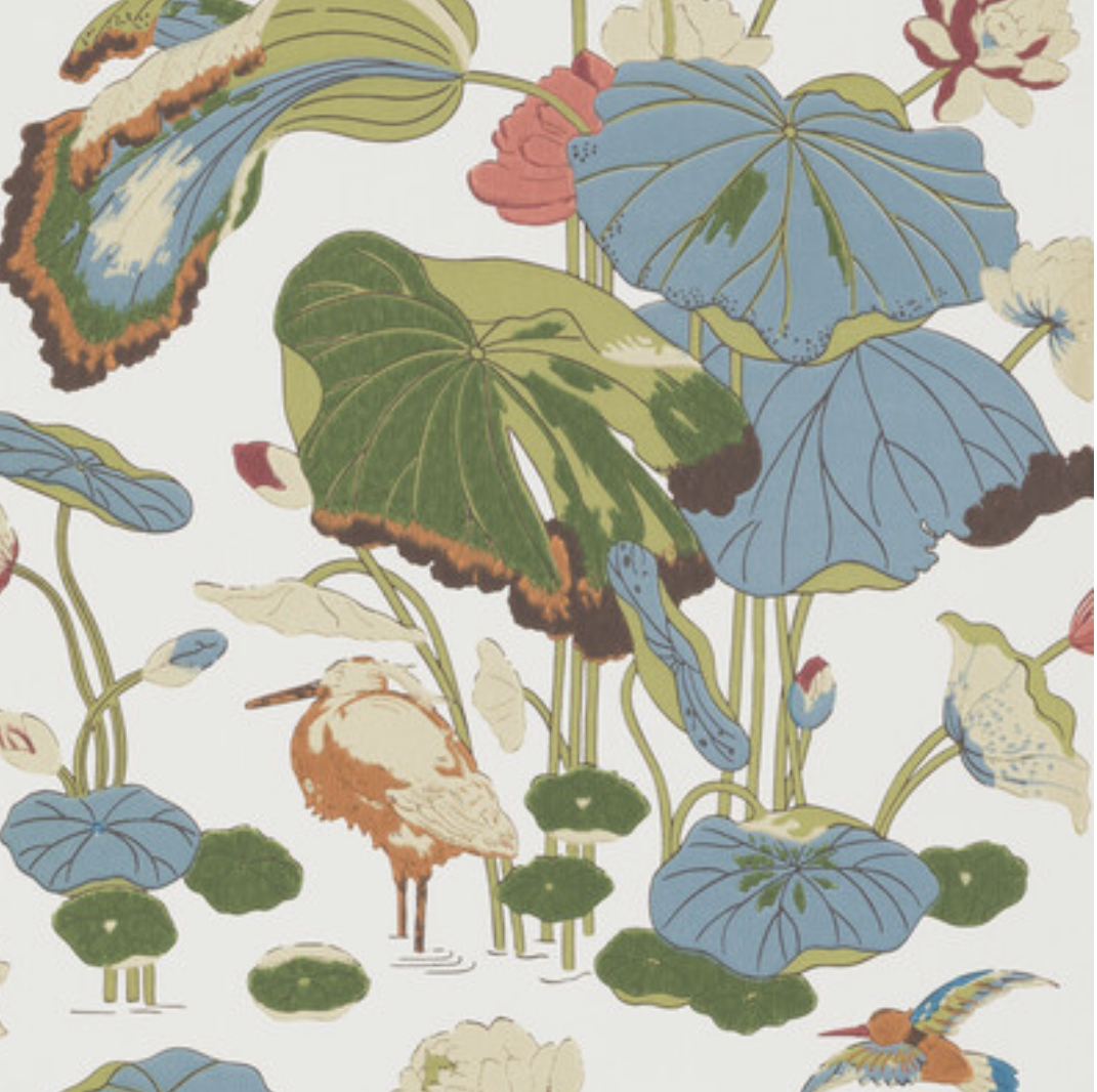
Top row, L-R: Ferns, Chifu, Magnolia.
Bottom: Nympheus.
Classic, elegant, beautiful – there’s not one of these I wouldn’t use in my home.
The usual position I find myself in, when choosing a wallpaper for a room, is that there’s always The One, and that makes the job quite easy. For this bedroom project, I have shortlist of about 6, which is making my life rather difficult! Have you got any greenery-based favourites? Let me know in the comments!
Really enjoyed reading this Sandra. Nice to learn about a bit of the history of the brands too and U love your style of writing 🙂
Author
Thanks so much Jayne 🙂